
Any suggestions?
Any suggestions?

Doesn't Segoe script cover this?
No, hence the question. :-)
i forgot the emoticon: >^p

4 years later and the options haven't increased as much as one would hope, but there is Dear Joe and Wonderbrush. (I cannot vouch for the quality of the Vietnamese, however.)
Thanks, I cannot remember why I asked for this, it was probably for an ad campaign. But thanks for the follow up. It's a shame we have so few quality options for Vietnamese.
It's not that hard to make up the needed characters when permitted -- any Adobe licensed font, for example -- but I do have a question.
A fair way down in the thread
http://typophile.com/node/62439
Hoang Dang seems to imply that SIL's .VIT treatment(s) are not proper; that the tone marks should ride over the different vowels. At least, that seems to be the logic of his remarks. Sadly, he never got back to answer the question. Has there been there any further discussion on this?

I'll ping Ben Mitchell, who did the new Skolar 3's Vietnamese.
hhp

My understanding is that the SIL fonts have the alternates for languages other than Vietnamese. (Did Hoang talk about the SIL stuff, I couldn't find that bit?) For Vietnamese, the circumflex-acute and circumflex-grave should not have the second tier accents centred. The grave can go on the left or the right, depending on the design/designer/client. After long discussions, we chose to put it on the right, to be more consistent with other stacked marks and to reflect the writing direction (and reading direction, perhaps). It also requires less kerning exceptions that way.
The logic of Huang's remark was that the so-called "accented" characters were really not that, but different characters. Like in Latin, an "e" is not a "c" with a midline diacritic drawn through it.
In that case, and as Huang showed them, the tone marks would ride ABOVE the character, not beside what only looks like an accent. The left-right positioning is a different matter...
I agree that -in terms of reading, but not learning to read- it's best to view accented letters as individual letters, but an element* not being centered does not kill that. Also, facilitating good spacing (both horizontal and vertical) is not a design factor to be ignored, since poor spacing ruins readability much faster than mildly confusable glyph derivation.
* BTW using the term "tone mark" actually reinforces what you seem to want to avoid.
hhp

According the Wiki Vietnamese Alphabet, there are 12 vowels in Vietnamese, namely
a, ă, â, e, ê, i, o, ô, ơ, u, ư, y
According to the same wiki, there are five tone accents that can be put on any of those vowels: grave accent, hook above, tilde, acute accent, dot below. It is also written, as Hoang Dang said, that the tone falls on the word. It is also said that there are two styles of tone positioning and, more importantly
In both styles, when one vowel already has a quality diacritic on it, the tone mark must be applied to it as well, regardless of where it appears in the syllable (thus thuế is acceptable while thúê is not).
To my understanding, that rule goes against putting the tone where a linguist would put it and reasoning from general linguistic principles may not lead to what is expected by native readers.
Michael, I have a problem with Wikipedia. Entries on the two subjects I know a great deal about have numerous errors, some very serious (they're both wrong and misleading).
Here's the problem: How can I then trust Wikipedia when it is something I know little about, esp. when it might be in conflict with another expert source?
* * *
So -- Is the position of the tone marks due to mechanical issues of typewriter or typesetting? How does a native write the script longhand? Wouldn't that be the best answer?
BTW, scansion marks in Latin have a similar, though not identical problem. They belong to a syllable, not a character (mirrors the older Vietnamese preference, no?) Further, I've argued scansion marks should always be at a constant height, so if a longum falls mainly over an l in one place, it should be at the same height when over, say, an e. They tell you how to parse something; they shouldn't bounce. Now, set some Greek poetry (polytonic Greek) with scansion marks...
So back to the question: if we remove all the things acknowledged as compromises (allowing they are sometimes necessary), does anyone know what is preferred?
Michael, I have a problem with Wikipedia. Entries on the two subjects I know a great deal about have numerous errors, some very serious (they're both wrong and misleading).
Those on advanced mathematics are generally correct and sometimes even quite well written. I have seen horrors on typography, but I would not judge wikipedia on that basis. Of course, better references are welcome.
This being said, in hdang's post 16 jan 2010, it is written
On Vietnamese diacritic design, i think that the type designer should understand how vietnamese words is constructed:
fisrt at all, there are 29 "basic" characters in alphabets list:
a ă â b c d đ e ê g h i k l m n o ô ơ p q r s t u ư v x y
From those letters, it should not be hard to find which ones are vowels and which ones are consonants. That should confirm the list of vowels.
As for the treatment of “tone mark (accent)” (in bold in his post), he writes
There is only one accent. Someone considers Vietnamese as double accent language, but it's view of non-vietnamese speaking people.
I see no reason to comment. The only important thing for this thread is the shape of that thing and where to put it.
The only important thing for this thread is the shape of that thing and where to put it.
Exactly the question. As rendered by Adobe & SIL, sometimes those marks are essentially *beside* the character (given that the "other accent" isn't an accent, but part of the character). Now if it's an x-height character, then the mark is over. I'm not asking about the left-center-right position, but the height.
Edit: And by the way, in order to fit it thus, the tone mark is rendered differently than when over those other characters. Shouldn't the rendering be consistent?
Whatever we do, we shouldn't let "longhand" dictate how we solve typographic problems.
hhp
Whatever we do, we shouldn't let "longhand" dictate how we solve typographic problems.
So with the Latin alphabet, we should use tiny, flattened accents over the capital letters, so that those who want to be "typographic" can set solid. Typographic "problem" solved.
Balance, always. And total solution, never. Have you not noticed that -in the best fonts- the cap accepts are indeed flatter (and set closer to the letter*) than their lc counterparts?
* In fact in the A-ring the accent is often fused to the letter. What does "longhand" say about that?
hhp
Well, here is another stylistic choice (Chalkboard SE):
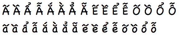
I guess since Comic Sans doesn't have Vietnamese they had nothing to copy and got creative...
hhp
Captured from web.archive.org on 9 Oct 2013. view this capture