Hi,
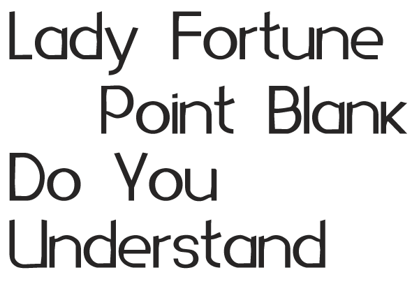
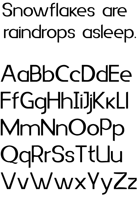
my first post here:) I'm learning graphic design, and unfortunately there is no typeface design class, but type is my hobby, but anyhow - judge me hard!
So, for now there's only lowercase characters, and I need some serious feedback, as I want to be sure about lowercase before going to uppercase.
My idea was that primary purpose for this type would be headlines and large sizes. But in the same time it would look good at small sizes.
Please comment on which details should I leave and which should go away, and any other comments would help.
I will release it under CC, so all the comments will return in finished and good(hopefully) type for everyone to use.
| Attachment | Size |
|---|---|
| putnja-critics02.pdf | 165.69 KB |