Hi,
Just joined Typophile and enjoying the various forum discussions.
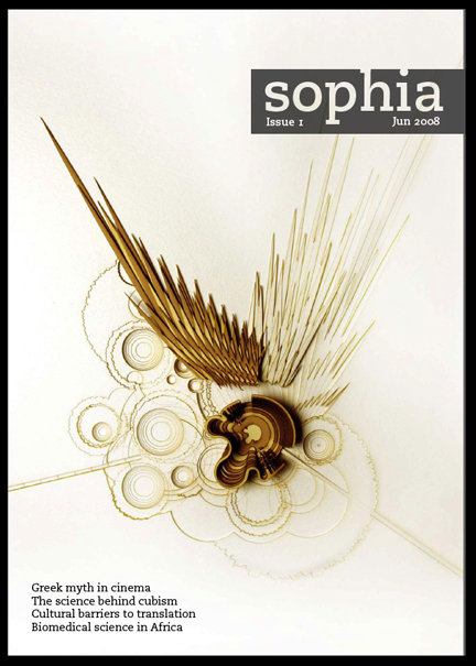
I set up a magazine at my University last year and have printed two issues. I do the editing and design but am just a hobbyist designer and still have a lot to learn.
The look of the magazine has been complimented by a lot of "lay" readers but I'd be keen to get any suggestions for ways to improve it for the forthcoming issue from people with a more discerning eye. The main typefaces are Caecilia and Arno. I don't want to change either of them as I think they help establish a visual consistency in the publication. I would be happy to hear more suggestions on grid layouts, combining type with images, supplementary information (there are some grey boxes with extra info in some articles) and contents page design. I'm wondering whether the article titles should be more interesting as well. I used different typefaces for these in Issue 1, but stuck to Caecilia for Issue 2.
Issues 1 and 2 can be viewed on the "Issues" page of the website: www.sophiamagazine.co.uk
I think I'm fairly thick-skinned so don't hold back too much but bear in mind it's an amateur magazine edited and designed by volunteers.
Best,
Ed