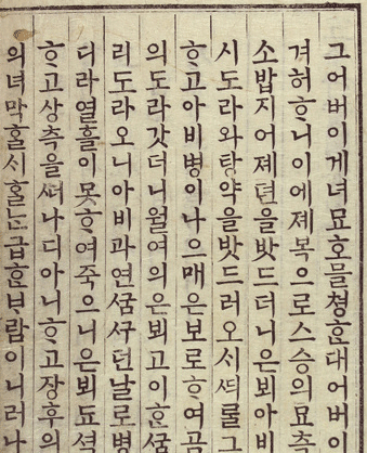
Knowing fully well that there is no way I'll get the time to design a complete hangul (Korean alphabet) typeface in the foreseeable future, I started sketching out an idea for a hangul typeface that I had been carrying around in my head.
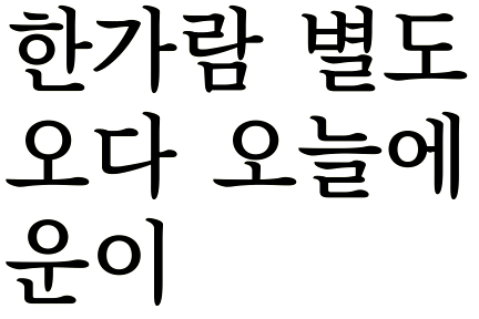
I'm just drawing around a dozen test glyphs. At this point, I'm most concerned with getting the basic proportions right. It's too early to fine-tune the stroke widths in the individual glyphs.
This would be a low-contrast serif text face, quite a bit darker than the text faces usually seen in Korean books. The biggest departure from the usual hangul faces of this genre is that for the moment I'm planning to do away with the 'serifs' on the ㅇ (the circular letter) completely. The glyphs are on the narrow side, with simplified and open forms intended to make it work for smaller point sizes. I've tried two different approaches for the 오: the first where the ㅇ and the ㅗ are connected and the connection vastly simplified, and the second where they are kept separate.
I've no idea where I'll go from here, but it's fun designing hangul and I wanted to share.