Hello Typophile-
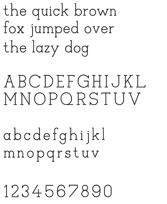
I'm hoping to get some feedback on my first attempt at a complete and functioning typeface.
Cosmos slab is meant to be a display face, but if I can make it legible at small sizes that would be a wonderful bonus. It was drawn in illustrator and brought in to fontlab where I'm endlessly tinkering with it. I'm currently working on the widths of the uppercase and numbers, as they are a bit out of tune. Any extra suggestions/ comments would be very helpful.
thanks in advance!
-elsa