help help help!
i'm trying to find the perfect text (and alternate display) typeface for a magazine i'm designing. i know that's a tall order, but suggestions are welcome.
the magazine, which showcases artisans and the places they're from, is oversized (10x15), and i'm playing with using very tall, narrow text columns. the other face i'm using, mainly for display, is HTF Knockout.
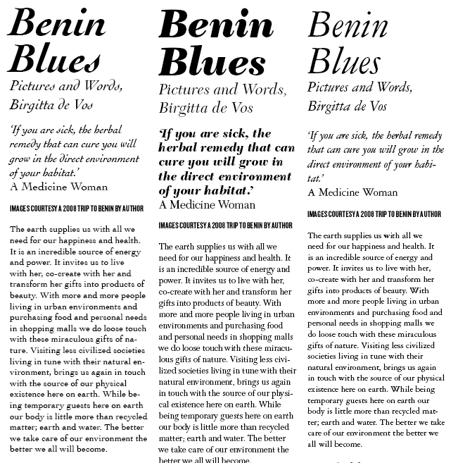
i need something that has an old-fashioned 'french' feel, probably a transitional face, and a lot of character. i have tried garamond 3, cochin and new caledonia (see below), but none is quite right. why? cochin: love the text face, hate the italic. garamond: too common. new caledonia: a little boring.
to top this all off i'd love for the face to have a display weight with either ultra high stroke contrast or or an ultra light weight.
HELP!