
I remember a well written description of of what constitutes a typographic revival, but I can't find it. any help appreciated.
I remember a well written description of of what constitutes a typographic revival, but I can't find it. any help appreciated.
it might have been on this forum, or it might have been a Hoefler booklet - my memory is fried.

Call It What It Is by John Downer?
Also: Revival

This is an interesting feature about type revivalism:
http://www.typeculture.com/academic_resource/articles_essays/pdfs/tc_art...
"Only when the design fails does it draw attention to itself; when it succeeds, it's invisible." (John D. Berry)

“Only when the design fails does it draw attention to itself; when it succeeds, it’s invisible.”
Ergo, all award winners are crap.

Nick, that makes me feel so much better about being unsuccessful in all those competitions I entered.
Nick Cooke

Nick: Ergo, all award winners are crap.
Award competitions are judged on the basis of looking at type, not reading it.
But John Berry has made the now common error of saying 'invisible' when he should say 'transparent'. A crystal goblet, to use Beatrice Warde's famous metaphor, isn't invisible, only transparant. Like good typography, it doesn't obscure the contents, but it can also delight with its own shape.
Award competitions are judged on the basis of looking at type, not reading it.
Awards are made by surveying the entries. Those that don't get noticed won't win prizes.
...crystal goblet...
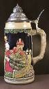

John, thanks for that analogy. Although I understood the concept of good typography should be invisible, I never agreed with it 100 percent, for the obvious reasons. Your analogy has made the concept crystal clear.
Uh oh. And the puns begin...
I have sometimes used the 'Belgian beer glass' explanation of typography: it's transparent, but the shape of the glass tells you what kind of beer is in it.
This is also, of course, true of wine glasses if one takes the care to serve wine in an appropriately shaped glass. In this case, the shape not only tells you what kind of wine you are about the drink, but also affects the bouquet and flavour.

So there is a twist to the crystal goblet. Nice analogy. I don't drink so this wouldn't have occurred to me, but I really like that.
So there is a twist to the crystal goblet.
There can be, but wine glasses with twisted stems are really naff. :)
Ha! Badumbump Pssshhhh!
Captured from web.archive.org on 4 Aug 2014. view this capture