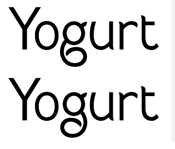
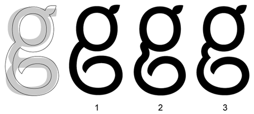
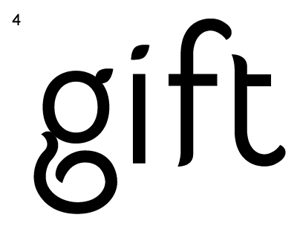
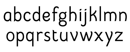
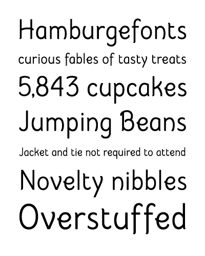
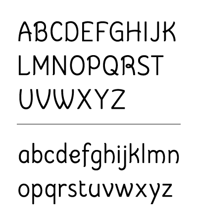
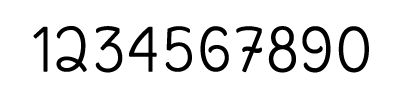
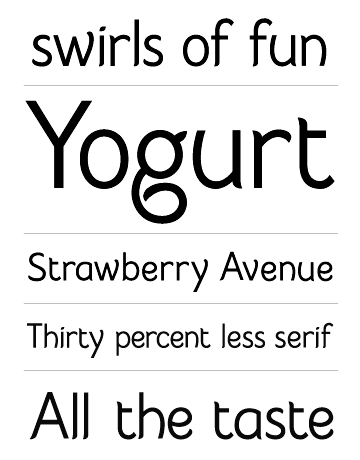
Hi all. I'd appreciate your thoughts on this typeface. It's currently the 26 upper and lowercase letters and I hope to expand it to bold and light weights with the full set of glyphs. I think I've identified the "problem" letters but I'd like to get opinions on that.
The initial plan was to create a straightforward, functional sans-serif but it morphed into more of a headline/display face as I went along and figured out its personality. Now I could see this being used primarily as a headline face, maybe part of an identity system, who knows.
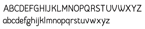
| Attachment | Size |
|---|---|
| floop_01.pdf | 67.97 KB |
| floop_02.pdf | 64.8 KB |