
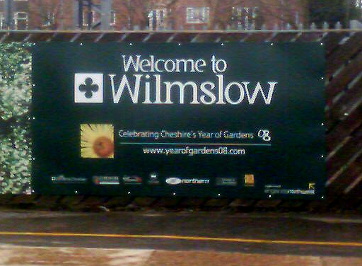
I snapped this on Wilmslow railway station in Cheshire, UK recently.
Is it wrong and if so why?
This thread ran to 2 pages of replies and only one was recovered, so replies are missing.
I snapped this on Wilmslow railway station in Cheshire, UK recently.
Is it wrong and if so why?

It’s mirrored (left-right). The contrast has the wrong direction.
Pieter

Hi Nick,
it looks
a) like an upside-down ‘M’, because the outer diagonals usually are more inclined, in a ‘W’
and
b) mirrored, because the contrast axis is in opposition to the tradition of translation-based (broad nib pen) contrast, and also what other letters like the ‘s’ suggest.
F
You're thinking with your nib, not your mind. Use your mind and tell me why it's wrong (without making any reference to tradition or pen-shape which are not good barometers of right and wrong).
Let me ask a different question:
"Why, when we look at a globe, do we consider north to be at the top and south to be at the bottom?"
Florian, your (a) was a good point but I'm not really talking about cosmetics.

I'm wondering why no one's talking about that hanging "thing" of m ;)
>>>I’m wondering why no one’s talking about that hanging “thing” of m ;)
I was doing everything I could to ignore it.

It's just wrong in so many ways. The client was probably convinced to commission a custom typeface by some 'designer' with the gift of the gab who persuaded them of its brilliance with his designer bullshit.
Total amateur hour.
Nick Cooke

It's a convention, based on pen nibs. Nothing more to it. If it looks wrong, it's because we are not used to seeing it that way. The globe thing is also just a convention.
(I should add that one goes against convention at the risk of confusing or annoying others.)

"...but I’m not really talking about cosmetics."
Oh I see what you're saying, the type should be black, or, the same color as the background for this font to work?
Cheers!

It’s a convention, based on pen nibs. Nothing more to it. If it looks wrong, it’s because we are not used to seeing it that way. The globe thing is also just a convention.
I'm not sure about this. It's possible to hold the nib at a different angle right? Couldn't the standard nib angle be what people traditionally liked?
A function of the variation in thickness is to imply direction based off of convention. So, it does look "backwards" to me. With the "W" and "l" repeated, my brain momentarily registered it as a single-word palindrome.

Carl, yes, of course you can rotate the nib. But it’s not that easy to make upstrokes with the broad edge. That, plus the facts that Latin is written from left to right and that most of us are right-handed, lead to the familiar contrast.

I find that letters must show some inclination. They must tell you, in some way, in what direction your eye should go. When we “revert the contrast”, as we say, thus going against convention, letters seem to tilt to the left, which “sounds” wrong; we know we read from left to right, but the letters are telling us otherwise. I've thought about things this way, too, and that's where I got. I now use this piece of information whenever I look at or draw any letter.
I think that's the main thing that really seems wrong. The rest – different stroke widths, no serifs on top of the lc i or the bottom of the middle lc m leg, the lc e, the lc t, etc. – isn't what we'd consider a great, homogenous, coherent and (classicly or not) beautiful design, but it's not throwing the average reader off. The Uc “W”, though, I think might. The lc one, probably not so much.
Oh, I forgot to mention that it has to do with not only the fact that we read left to right, but also downwards.
That doesn't bother Wilmslowians, who are well versed in boustrophedon to boot.
...it’s not that easy to make upstrokes with the broad edge. That, plus the facts that Latin is written from left to right and that most of us are right-handed, lead to the familiar contrast.
I'll buy that. Regardless of the cause, the effect on perception is powerful. It does feel upside down.

"the effect on perception is powerful"
I'm really beginning to wonder how much of our perception is "learned" through observation, and from convention. I mean, I agree that thing is painful to look at. But it would be priceless to get some reactions from total laymen, and see if it feels upside down, or odd in some way, to them too. Or not.
So, does anybody have any normal (non-type-obsessed) people around? :-)

Is it wrong and if so why?
It's wrong because someone has started out with a probably "correct" typeface and then managed to destroy it so bad by mirroring letters and snapping off serifs.
Some peple shouldn't be allowed to use Illustrator... :)
I don't have a problem with it, because the effect is considered, not inadvertent.
Professional, not vernacular.
Whether it is an award-winning disengagement from convention is besides the point.
There's nothing wrong with the sentiment or principle at work, although one may quibble with the execution.
Whatever, diehard typographic traditionalists were not included in the target market!
Nick S: Why do 'diehards' insist on contrast being 'thin up fat down'?
Is 'thin up fat down' in the same bracket as the globe I mentioned at the start?
Nina: Why is it painful? Do you mean 'painful' or do you mean simply 'unusual'? Or does unusual actually cause you pain because you have to think about it? How long would you have to see it before you stopped thinking about it and you had finally become anaesthetised to it?
Goran: You have put double quotes around the word "correct". Are you admitting by putting it in double quotes that there is actually no such thing as correct?
Can the designer of this typeface be commended in any way or are you all going to hang, draw and quarter him/her simply because you didn't like the end product?
By the way, if you're enjoying this thread, you might also like this one which was all about handedness.
Yes. I just wish I had put double quotes on "wrong" aswell.

It is not the anti-penlogic that bothers me. It is the awkward angles of the legs which leaves a huge space at bottom center and probably makes the A to W fit very clumsy looking. If you are going to go that way, go further and make the outer strokes much more to wards the upright and make the rest of the glyphs a system to fit. I know the M is often done in this way. It appears to work for the M for some because we are used to it but I think there may be more to it. The weight moves more to bottom both with the traditional M and W--is this visual gravitation? I don't know but the Romans did something that way for a reason. Perhaps using the V as center, who knows? My guess is that there is some basis beyond traditional habit. Flipping an M for a W can also possibly cause confusion between the two letters. With one with straighter sides, the confusion is minimized.
I can only say that it looks awkward to me beyond the tradition. I think it makes itself look far too different than the rest of the glyphs to make sense as a family or even as a system. It make be more believable as a sans than a roman since roman faces evoke more a traditional expectation. I might like to see all the stroke weight and contrasts flipped to match to see if that helps.
I might add that I don't mind someone trying this kind of solution in the least but I don't think this begins to work yet and could use more time and effort to push it closer to something that works without me having to say, "WTF is that?"
ChrisL

This is wrong from the standpoint of convention. But that doesn't make it wrong from the standpoint of effectiveness (which I think is the point you want us to get, Nick).
However, I don't think these modifications add anything positive to this particular design. Average Joe probably wouldn't notice anything unusual. It's like trying to be rebellious by putting a temporary tattoo on your shoulder and wearing long sleeves. There's no meaning or point to it.
For an example of unconventional glyphs that do add meaning see Chester's modification to Galaxie Polaris for the Alliance for Climate Protection (http://www.wecansolveit.org/). That is certainly an unconventional w, but it is, in a nutshell, the brand and the message. Which makes it effective. [edited last sentence because it made no sense!]
Is ’thin up fat down’ in the same bracket as the globe I mentioned at the start?
No, because it derives from a practical constraint, not an arbitrary convention.
However, it could be argued that people more often face North when making maps, so as not to get the sun in their eyes.
BTW, the "s" is wrongly stressed, from the perspective of chirographic consistency; but it would read Wilmzlow if flipped. The designer didn't push the envelope that far.
>>>However, it could be argued that people more often face North when making maps, so as not to get the sun in their eyes.
Not in the Southern hemisphere they don't. You're being northist/southist (don't know which)! Latitudist?
Whew, I just read that entire thread you linked to, Nick. Took me a while. (Including Google time to find out if Wilmslow might be a left-handers' commune.)
"Or does unusual actually cause you pain because you have to think about it?"
Hey, since when is thinking painful?
Maybe I should have put "painful" in quotes. What I meant was it's uncomfortable; although at the same time I realized it's only really uncomfortable because it's against convention, or what I'm used to seeing. But I still couldn't help the effect: My eyes are clearly identifying that as a flipped "M", but it's pretending to be a "W"; and that "flipping effect" is pretty… startling.

I might like to see all the stroke weight and contrasts flipped to match to see if that helps.
Are there any typefaces out there with reverted contrast all over?

To me the W looks clunky because I can't see any purpose to the modifications or any unity with the other letters. It reads as an M (almost) and draws too much needless attention to itself. I'm left feeling like I don't understand the message.

Nick... my wife is mad that you posted that picture of her. That was a private shoot : )
In pen rendering the angle used to form the M, W, N etc is shifted from 30 to 60 degrees to equalize weights in the formation of the letters.
The "s" is correct, the author just brought the serifs the way of the turn instead of incorporating vertical serifs, this version is out of sync with the rest of the letters, i.e. it is more brush than "typographic."
Michael
Not in the Southern hemisphere they don’t.
True, but the map makers were in the Northern.

It's wrong because it's anti-systematic.
There is a graphic system expressed in the structure of the other letters, the W is not following the structural rules of the other letters so it stands out with ackwardness.
It also looks wrong because it goes against what we are accustumed to see, not mattering if we know anything about stroke modulation and contrast.
Héctor

Great design. Nothing wrong with it — it generated 32 responses from a medley of professionals, eg in billable hours about… uh…
. . .
Bert Vanderveen BNO
>>>Great design. Nothing wrong with it — it generated 32 responses from a medley of professionals, eg in billable hours about… uh…
Tell you what, if it helps, don't respond during office hours ;o)

>>>True, but the map makers were in the Northern.
All Arabic maps were south oriented, and they were the original accurate maps that Europe acquired.

Interesting... I visited the site on the billboard and it brought me to visitcheshire.com. The minuscule "v" has the stroke contrast correct (according to convention). So does that mean that the font designer got it right and the "graphique artistes" took matters into their own hands with the "W/w?"
I wanted to dig deeper, and nabbed a PDF (the embedded font is called "ExclusivelyCheshire") from the site. Turns out the "W/w" nastiness came from the font designer. Check these out. (compare the "M" and "W." Not even a reversal and flip!)


So what's the point of this: Wilmslow ain't pretty, but it sure is different?
That's the vibe I'm getting.
I think Héctor is spot on when he says it's "wrong because it’s anti-systematic". I mean look at this, not even the weights of the letters have anything to do with one another, let alone proportions.
And what happened to the rest of the "r" anyway?

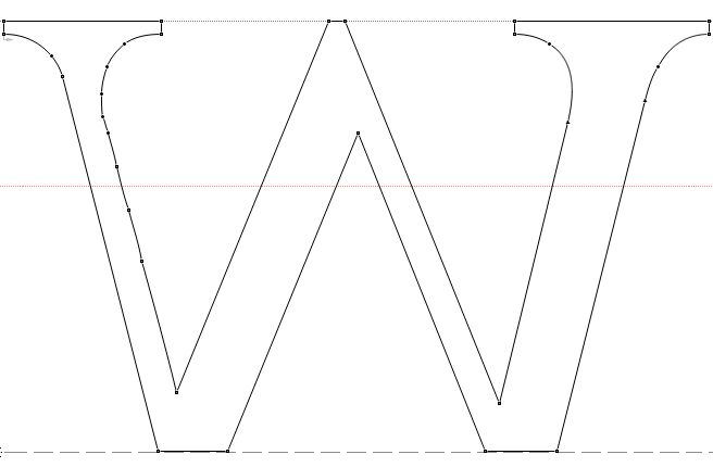
Quite strange typedesign decisions from Access Adv. Look for example at this strange lowercase w from above mentioned PDFs:
I think the Many Comments are due to the "what really is wrong" mystique that has been built up in this thread. If this face had shown up in the Critique section I think reactions would've been a bit different.
Dunno… I'll go out on a limb and say I think this is simply bad type design.
Maybe it's wannabe Po-Mo, or supposed to be rebellious, undermining conventions or whatever, but in any case, I don't think it works.
I will gladly stand corrected if you guys can convince me I'm wrong.

Silly me, I thought the only thing wrong with it was that it was hideously ugly.
That, too, JLT :-)
ChrisL
All Arabic maps were south oriented, and they were the original accurate maps that Europe acquired.
I didn't know that. Bang goes my theory.
Any other explanations?
Frode Frank: "Are there any typefaces out there with reverted contrast all over?"
That's an interesting question; do you mean something other than so-called Italian display faces with their inside-out contrast?
I used reversed contrast in Artefact, in a deliberately inconsistent manner.
As it's a postmodern face, the purpose is to "address the issue of..."
***
I have considered reverse contrast versions of A, V, W, for contextual substitution in words such as LAWYER.
This isn't too different, as a design strategy, than the variation of axis found in the Baroque letter.
As Bringhurst notes, the Baroque letter came about at a time when typographers began mixing roman and italic on the same line, so there was an awareness that stress didn't have to be in a consistent, "pen held at a steady angle" manner, and type designers experimented with that idea.

I'm learning a lot from this post. :) I really want to dive deep into type. I wish there was a school of design specific to typography. Nowadays I'm lucky to get 3 classes of it.
My observations is that it simply feels weak. It feels like it fades into the rest of the word rather than being a statement or signification that the word has begun.
daniel
There's nothing wrong, I can still read it.

The "W" feels quirky (for many of the reasons mentioned above), but seems to fit the rest of the lettering. Definitely not my favorite logo type but not wrong.
@ daniel - The more I learn the more I realize how much there is to know. This discussion has taught me a great lesson on how to answer comments with questions(?)
Hmm allot of interesting points that I think are inter-related. I'm a newbie to type design, I usually listen rather than talk here but it strikes me that what is wrong with this font and indeed is the basis of convention in large areas of design/aesthetics and from what i can see also relates to type, that being nature. Golden ratio, colour theory etc (you all know the list) breaks down to either biological or instinctive values (such as blue being used for medicine bottles because there is nothing naturally blue that can be consumed without harm, it signifies a warning even to those who have no idea). This font fights how we read (as previously mentioned above), it fights how we write (again previously mentioned above) and the way we do those things derives from our physical nature. Without being able to strongly link terminology most of the conventions it goes against can be clearly drawn back to natural movements, natural rhythms, forms, relationships... not just in human beings but in everything that grows around us. I think this font strikes us as wrong because it goes against not only how we do things but the natural order around us, but it is still readable, so to the untrained eye it just sits uneasily in the back of the mind, something they might more easily recognize later. Indeed likely successful in some of its aims but not through beauty or grace which would have to contain natural harmony (in itself and the world around) or clear decisive moves that are discordant to make a obvious point (that would have to be highlighted at very least via consistency).
so-called Italian display faces with their inside-out contrast
I quite like convention-challenging fonts. I never seriously used Antique Olive, but did a whole book in Incised. Was not responsible for selecting the typeface, but was pleasantly surprised how well it worked as a text font.

Captured from web.archive.org on 10 Oct 2013. view this capture