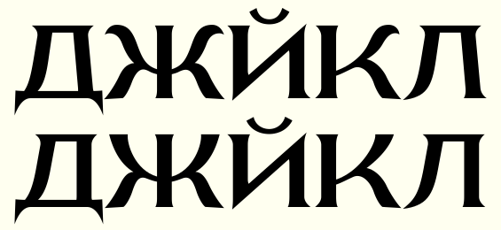
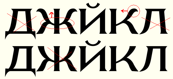
I've been picking at this for a long, long time, and I think that it's finally going to be ready for release just as soon as I can whittle down the kerning pairs so that it doesn't drop half of them at random upon generation (apparently 250 pairs is too many... and yes, there are classes), and then learn how to do the hinting right.
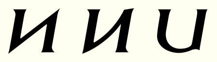
Before I do, though, I should start letting other people look at it again. Is there anything I don't see? (I see the crap kerning.) I'm particularly interested in opinions on how I've handled the nonLatin alphabets. I know there is something inherently perverse about making Greek into a biform unicase, but Cyrillic takes to it quite naturally, and I hope it's as successful as I, an anglophone, think it is. Are there any unacceptable transgressions? And, if you hope to use this font yourself, no matter where you are, are there any characters you would expect to use that are conspicuous in their absence?
| Attachment | Size |
|---|---|
| cerulea09.pdf | 394.55 KB |
| cerulea10.pdf | 394.52 KB |