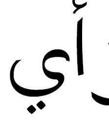
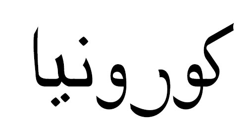
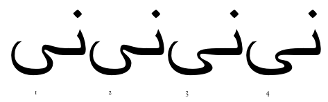
I went on a design spree and finished this up within about 2 days. There are still a few rough edges like some of the horizontal guides not all being exactly the same height (off by 1 unit or less). It seems to maintain its connectedness and while the two Arabic speaking friends I had both said it was "readable", since they're not design majors I can't trust them beyond that :)
This was designed to be a part of my megafont Coruña, so I attempted to maintain color and weight accordingly (see the mix with Greek / Cyrillic / Tifinagh), but I'm pretty sure I avoided most of the pitfalls of Latin-users making other scripts, e.g., highly variable x-, descender-, and ascender-height, etc.
A brutal critique (if needed) is welcome, so please don't hold back if it needs tearing apart.
| Attachment | Size |
|---|---|
| First Full Draft.pdf | 418.76 KB |