
I need to come up with a new scheme for titling these posts. Either that, or stop making progress.
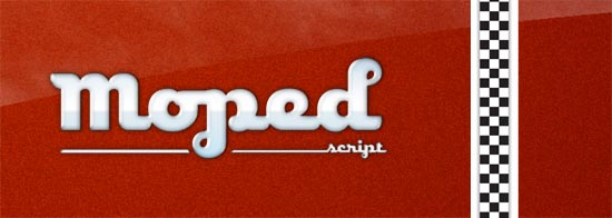
First we have the basically complete:
And here is a peek at:

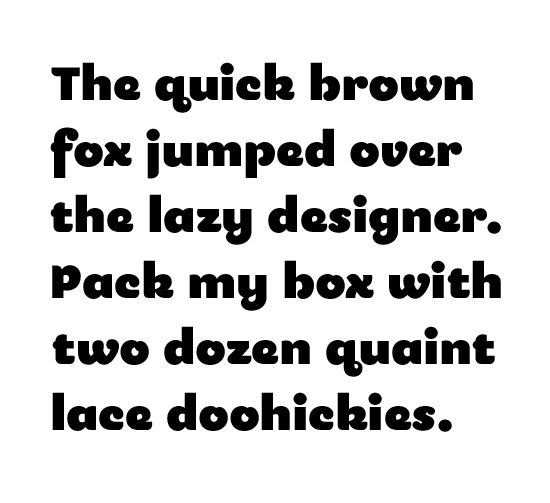
Apart from disconnecting the script version, many of the lowercase characters were redrawn. The r and s for example. The s was particularly challenging. I tried all kinds of crazy forms from scripty, to descending, to deco... in an effort to resolve the heavy stroke weight and small x-height. It’s basically a game of balancing 1.stroke width vs. other glyphs, and 2.overall darkness of the character vs other glyphs. I opted to dial the slider closer to matching stroke width. Yes the s is dark, but at large sizes (a lets face it, this is not a workhorse text font) it was the better solution. I’m also reworking the caps so they will play well with each other. Some of these changes may work their way back into the script caps.
Lastly, I played around with an extended version:
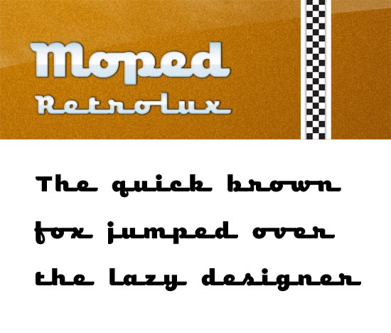
I was surprised how a little extending of the connection resulted in maximum retro-fitting. I also had to redraw some characters to work here.. notably the f. My initial drawing only works in the tight quarters of the original spacing. Extend the bar of an f long enough and it’s not an f anymore. I also included this new variant as an alt in the regular script version. The caps were also a challenge, especially the non-connecting ones (like D). Connecting to the lc looks bad, big space looks bad, small space looks bad, so I ended up making extended caps and using a medium space. While this version pushes the design closer to existing types in the genre, I figured it was worth it to give Moped yet another voice.
I think that is what I’m liking most about this little family. You can dial in the how retro you want to go: sans -> script -> script extended.


