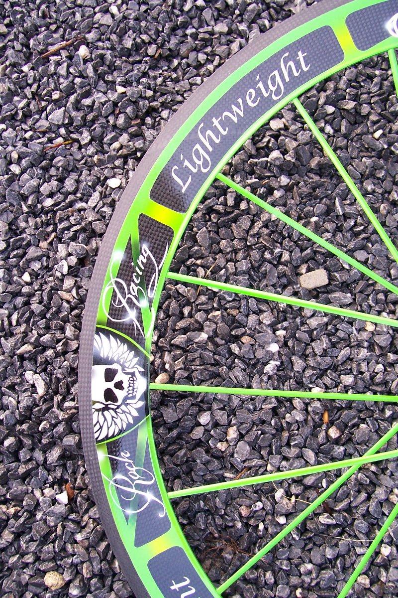
I was just wondering what you good people thought of this typography / branding on these:
the kerning seems to leave the type like broken tombstones in long forgotten graveyard..
http://www.light-bikes.de/website/new/wp-content/uploads/2008/03/cipo2.jpg
http://www.roadcycling.com/artman/uploads/lightweight_1_002.jpg
http://www.zweiradpool.de/u/53aPic1B23508168_zz_LightweightStandardIII.jpg
(myself; i think it's completely dreadful, unique but terrible)
it seems to me they are trying to go hand drawn script but they don't really know where to start. so they chose something 'scripty' and 'typed it in'
http://bikerepairman.com/campagnolo_logo.gif
http://home.pacbell.net/trh-arch/alfa/script.jpg
oh and these are not cheap wheels either.