Hi,
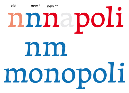
in the last day I started to draw these letters. I started with a sketch I made while thinking about the recent Legato thread. I don’t know if I will be able to transform these in a complete set of characters, so I decided to start the thread.
The idea is behind my initial sketch was the contrast between an upright counter and a stretched contour (the dashed lines, more or less).
That’s all, I must say that I quite hate the 'a'.

| Attachment | Size |
|---|---|
| first_pdf | 223.27 KB |
| typo-4.pdf | 9.62 KB |
| proof-2.pdf | 18.91 KB |
| proof-3.pdf | 36.58 KB |
| proof-4.pdf | 42.73 KB |
| proof-5.pdf | 45.54 KB |
| text.pdf | 34.88 KB |