Typophile

Brick-Layer: My First Typeface

GoodLoud

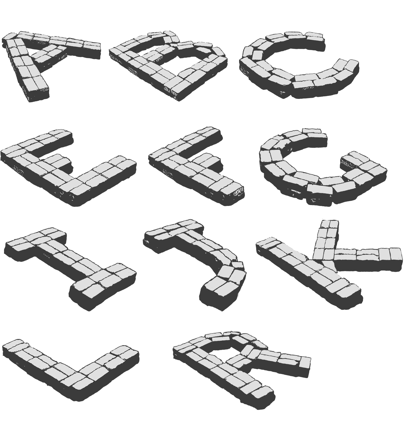
There was a pile of bricks sitting in the front yard. I have no idea why they're there, but they have been there forever. I have to design a typeface, so I thought that using the bricks for that would be pretty neato. So I made all 26 letters (sorry, no symbols or anything...yet) and took photos and edited them down to where they would be simple enough to use practically. I'm a pretty big fan of block letters, so theres that as well. I haven't finished editing all of the letters, but I have to get something up here now and figure this will at least get the point across, I hope. Please let me know what you think. MORE TO COME!

AttachmentSize
brick_layer.png545.67 KB

looks like lots of fun.

nice job.

the particular angle of the letters might make them a bit tough to work with as a font or .eps alphabet.

you might consider doing some sort of upright version?

Nice... made me smile. I agree with beejay on the angle you're using... You might want to try different ones, to see which will look best when forming words.

There’s nothing here that won’t work as vectors; if you autotrace the gray and black areas onto two layers you could turn this one into a really great chromatic face.

Thanks y'all. Beejay - when you say that I should consider doing an "upright version," do mean that I should explore using a different perspective entirely, or simply rotating each character such that they should be straight up-and-down?

i guess it would depend...what are your intentions for this?

having a traditional horizontal baseline would be helpful, but not necessary, if others are going to use these.

have you tried rotating the letters as they are now?

Captured from web.archive.org on 16 Apr 2015. view this capture