it was just one week ago that i made my first post here.
yeah, it seems like much longer than that to me too...
i guess, like they say, time flies when you're having fun.
anyway, i'd like to thank all the people here who have
welcomed me, and made me feel at home. sincerely...
anyway, now that we have exchanged our pleasantries,
it's time to get to work...
i've programmed an app that takes the text of a book
as its input, and outputs a .pdf version and .html files.
one .html version includes the whole book in one file.
another .html version splits the book up into chapters,
creates a web-page for each chapter, and links them...
the third .html version splits the book up into _pages_,
and creates a web-page for each _page_ of the book...
this version puts an image of the page next to its text.
(it was originally developed to proof o.c.r. output.)
this granularity-level allows people to make comments
about specific aspects of the book, so each of the pages
has a form to collect the comments, and error-reports.
(that form is extremely primitive at this point; so be it.)
the main idea of this page-by-page web-site version
is that authors should corral and focus their readers,
in order to establish a community around their work,
cumulating small gifts from fans to make their living.
in this vein, the .pdf version has a link, on every page,
that takes the reader to the web-page for that page...
thus the .pdf and web-version are tightly interleaved.
now, the web-version has lousy typography, of course,
because it lives in the browser. not much hope there...
but the .pdf version? well, there's some hope there.
and that's good, since the .pdf version will be what'll
be used when fans take the print-on-demand route,
via lulu.com, createspace, or a slew of future options.
but my main goal is to make the .pdf readable as is,
as an e-book, on-screen, and for that reason, i am
eager to apply the lessons learned by typographers
-- or, more aptly, _book_designers_ -- in the past.
at the same time, i must live within the limits that
are imposed by relatively scarce resources on the
hand-held machines -- the iphone, kindle, etc. --
that currently make up the e-book infrastructure...
in the large realm, the one thing that challenges
resources to their breaking point is hyphenation,
especially since it must be real-time, on-the-fly.
we don't have enough firepower to do hyphenation,
not correctly anyway, and doing it badly is no option.
but if we can't do hyphenation, the next question is
whether we can expect to do justice to justification.
loose lines are bad in print; they're awful on-screen.
it would be very sad to give up on justification though,
because -- perhaps more than any other variable --
justification is what makes a book "look like a book"...
and to the extent that e-books can "look like a book",
we will ease their introduction to the public at large...
(it is for this reason that the kindle currently justifies,
even though the white-space rivers look like _crap_.)
so i'm doing experiments on how to keep justification
-- even after we've kicked hyphenation to the curb --
and i would like feedback from book-designers here.
if my experiments fail, i want you to say that, loudly...
i don't have anything invested in any of these tactics,
i'm simply trying to find out if any of them will _work_.
if they don't work, you won't hurt my feelings to say it.
(and even if it _would_ "hurt my feelings", you should
say it anyway, because truth compels you to be honest.)
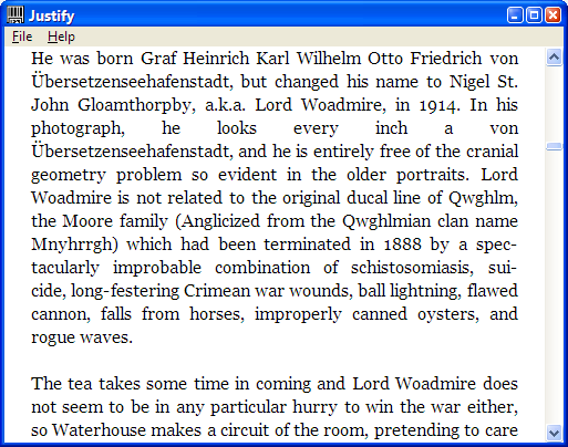
in order not to bias my experiment, i used actual text
from an actual book (one recently released by o'reilly).
to avoid copyright concerns, however, i scrambled
the text. i randomly replaced every lowercase vowel
with a different lowercase vowel, with the effect that
the general tenor of the words and lines was retained.
(although it probably raised havoc with the kerning.)
i then used my tool to create .pdf and .html versions.
the text was unhyphenated, but i did justification on it.
so, the first question i have for you is a simple one:
> "of the 144 pages within this .pdf, how many have
> an unacceptably high number of too-loose lines".
ok, maybe that question isn't _quite_ so simple, with
all of its inherent vagueness -- what constitutes a
"too-loose" line?, and what's a "high" number of 'em?,
let alone an "unacceptably" high number?, and what
about the pages that don't have any justified lines? --
but you get the general idea of what i'm asking here...
in general, did the tactics that i used make it work?
so, there are two ways you can look at the pages...
you can just download the .pdf:
> http://z-m-l.com/go/bomoc/bomoc.pdf
or you can use the online page-by-page version:
> http://z-m-l.com/go/bomoc/bomocp001.html
in the web-version, clicking each page takes you to
the next page. or you can jump to a specific page
by changing the zero-padded number in the u.r.l.
for instance, here's the u.r.l. for page 123:
> http://z-m-l.com/go/bomoc/bomocp123.html
if you want to talk about a specific page, tell us the
page-number, so we can look at that page online...
there are lots of things that are downright _ugly_
in that .pdf. it's just the starting point from which
i will be demonstrating several improved iterations.
so there is no need to belabor all the bad aspects...
(especially the bottom-balancing should be ignored.)
right now, i'm looking for feedback on loose lines.
oh yeah, what i did is i used a multi-line approach.
not the sophisticated ones used by tex or indesign
-- again, limited resources, and all in real-time --
just a pretty simple one. nothing novel about that...
i did, however, throw in a couple of other little tricks.
i believe they should be pretty obvious to you experts,
but i'll let you tell me what they are, and not vice versa.
and then, of course, i am curious if you think that they
are tricks that are "legit" or not, and why you think that.
-bowerbird