
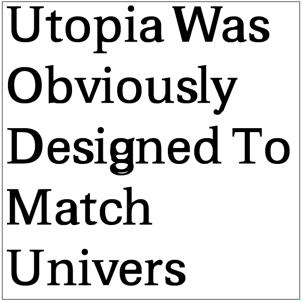
I simply pasted the outlines of Univers onto Utopia in Fontlab. ZERO adjustment. Stem widths, glyph widths, x-height, cap-height, they all match up perfectly.
That being said, Slimbach did a superb job. Nearly faultless.
I simply pasted the outlines of Univers onto Utopia in Fontlab. ZERO adjustment. Stem widths, glyph widths, x-height, cap-height, they all match up perfectly.
That being said, Slimbach did a superb job. Nearly faultless.

Tracking.

Is that the old Utopia or the newer version? And what happens if you paste them on top of each other at the same size in Indesign?
That's the open source Utopia on top of the open source URW U001, AKA Univers. Although I have the non-free versions of them, I felt it would be more appropriate to bastardize something that I have permission to edit. I call it "Utopivers" :)
I haven't attempted to paste separate text boxes onto each other in Indesign or Illustrator, but I do know that the metrics are different so that wouldn't work as well.

You could do that trick with a lot of different partners, Dan.
@Nick
I know there are a lot of fonts out there that are similar structurally, but when you look at the outlines superimposed in Fontlab, the results are uncanny. I actually was curious and intended to ask what other matches there are out there that people can think of.
Are you saying that this happens MORE OFTEN than we realize?
Obviously, designs from the same creator often match, such as Gill's work, or Frutiger's other designs, but how often does a type designer create something to match another typeface _without obviously stating that fact?_

Among other things, this is a nice demonstration of the structural relationship between this style of sans serif and serif types based on an expansion stroke model and a vertical axis. I've been playing with Karsten's glyph tweaker tool, turning Didot into Helvetica and vice versa.
Given how similar the proportions of Frutiger’s typefaces are, it could also be that Utopia’s proportions were modeled after Meridien.
Are you saying that this happens MORE OFTEN than we realize?
I expect so, if my experience is anything to go by.
For instance, I have benchmarked several faces commissioned for newspaper redesigns against the faces they were to replace, in terms of color, apparent size, and copyfitting. Brown Extra Bold is matched against Franklin Gothic Condensed in those respects.
I didn't copy any of its parameters per se, but tweaked Brown until it was a touch tighter and a touch darker. So if you were to superimpose the two faces, no doubt there would be a similar overlap to your example.
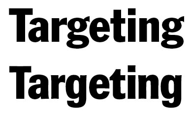

Wow, interesting discovery. Although some things aren't actually identical, if the advance widths are, that's a big deal of itself. BTW, I'm not buying the "this happens all the time without intent" business.
What made you think of trying this?
hhp
... if the advance widths are [identical]...
They're quite different, but the lower case stem widths are almost identical (though somewhat warped), and so is the x-height and ascender height.
“this happens all the time without intent”
I can't speak for other type designers, but in this case I had already designed a serif type for the paper, which they were using with Franklin Gothic, and they asked me to design a replacement sans which matched that serif in style, and Franklin Gothic in weight and copy fitting. So my intent was quite clear. Of course, I would have rather designed something more original (and I did get that opportunity later with the same client), but the challenge here was to do something close yet with a different personality, and without point piracy.

In the original example, it would be easier to see the dependence in outline mode, I feel that the solid fill could cover up discrepancies?
@hrant
I first noticed the similarity a while back when I was helping my college newspaper's new design director to re-design. He wanted to use only free or open source fonts, because he's a FOSS nut from Korea, so I insisted that we stick to at least the professionally designed typefaces. Thankfully, the body copy was easy, Bitstream Charter and Utopia are both available. Matching them with a non-crappy free sans became the priority, and that's when I realized that Univers matched perfectly. We would swap them for headlines, and it worked great.
@paragraph
I don't have Fontlab at work, but I can show some outline examples tomorrow. But you can download the abomination here if you want to look at the outlines yourself

I’ve been playing with Karsten’s glyph tweaker tool, turning Didot into Helvetica and vice versa.
Huhuhu, what's this John? I want it! :=)
http://www.kltf.de/kltf_otproduction.htm
The Glyph Tweaker tool allows you to distort existing outlines in a number of controlled ways, such that you can e.g. make glyphs wider while retaining stem weights. It doesn't do it terribly elegantly like Tim Ahrens' RMX tools, but unlike them it doesn't require an MM font. It works best for very small adjustments, but even these will usually need some manual clean-up if you are trying to produce nicely finished details. But I'm finding the brute force approach useful, even with the distortions to terminals and joins, for looking at what is revealed about the basic structures of letters if, for example, one starts with a high contrast design like Didot and reduce the contrast so that the stroke are more monolinear, or with a low contrast design like Helvetica and increases the contrast to that of a Romantic typeface.
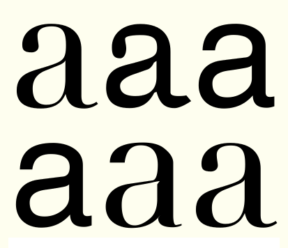
[More of this sort of thing will probably feature in my lecture at St Bride's next month.]
PS. If you use any of Karsten's clever scripts, be sure to make a donation via the PayPal buttons on his website.
.
Another funny creature is "Helvetica LT Standard Oblique" (filename: HelveticaLTStd-Obl.otf). Who thinks that quality typography requires that letters with accents should have the same matching set width as the letters without accents will have to learn that this is not true for Helvetica:
www.sanskritweb.net/temporary/Helvetica-crap.jpg
I never use Helvetica, so that the crappy set widths of Helvetica do not bother me, but since there are some people around here who use Helvetica, I think that Gary Hustwit should have mentioned this "set width hallmark" of Helvetica in his promotional film.
@John: thanks, I have seen them before on Karsten's website but I forgot. In fact it's unlikely I will use them as I don't have Python installed but maybe in some quiet moment… :=)
In the end, they make something similar to what Ares FontChameleon or the old Incubator did, right?
With the difference that FontChameleon worked mostly as a blending tool, with two source typefaces.
Captured from web.archive.org on 23 Oct 2013. view this capture
