This is my design for a fitness store, just want any critique at all, i'm not to sure if the grey is a bit too much.
Type - Avenir
| Attachment | Size |
|---|---|
| heroes.jpg | 12.96 KB |
This is my design for a fitness store, just want any critique at all, i'm not to sure if the grey is a bit too much.
Type - Avenir
| Attachment | Size |
|---|---|
| heroes.jpg | 12.96 KB |

I like the logo very much. I like the colors very much. But...
There's too much going on that distracts from these great elements. The rounded corners of the logo's frame square don't match the style of the logo, and frankly, it's altogether unnecessary. If it were me, I'd scrap the square altogether or use it to encompass both logo and logotype (perhaps knocking out the logotype in white or a lighter color?)
The yellow knobs on the barbell need a smidgen more air to match the logo's other spaces.
The multicolor logotype isn't working for me. I'd use the darkest gray (only) from the logo square for the logotype. The scale is off, too - why is it so small compared to the logo? If you're going to have the barbell crushing the logotype, it needs to be look more intentional. :)
Have you searched for a font with more character? Perhaps something with more width (something burly like Dienstag or even Taku) may compliment the logo better. Right now, the logotype looks wimpy and disconnected - like an afterthought.
Now that I've torn it apart, let me add that I think it's pretty cool and headed in the right direction. The colors are especially pleasing, and work well to attract men and women to a fitness store, which I think can be quite hard. Well done.

I would use all caps in flavor that’s not so geometric, pull the type up into the box so the weight rests on it, and knock it and the weight out of the grey. Then use an ever-changing color palette to keep the identity fresh.
If you remove your first draft of the logo, the entire thread makes no sense.
hey alaskan
i don't fully understand what you mean, sorry for sounding stupid, i just want it to look professional and it just doesn't, i cant see it as being professional and i have a exhibition of my work coming up and i want to show it off. I like the weight idea, also representing the H.
Rather than adding your newest draft in a new comment (in this thread of the forum) you edited your first comment, and removed the original draft. My top comment and James's comment refer to a logo that's been deleted -- and we can't edit our comments. Anyone who reads this thread will be confused.
The whole idea of this forum is to critique the progression of a logo, and you won't get any feedback if people can't figure out what's going on.
Your new version needs some air. The logo is too close to the logotype, and the scale doesn't feel right. The two elements are competing with each other rather than working as a unit.
does this work better? i've added more air, but i don't know about the colour of 'HEROES' is that maybe why it might still seem like its competing? is the type better as well?

Certainly better. The mark is a bit too small compared to the type though.
Also, and perhaps it's just me, the orange bar seems to be not centered vertically.
what about this one? this is another idea i came up with?

I also see the crossbar being uncentered.
another variation for heroes fitness store.

Sorry, I did not see the first draft of this logo but hope I can make some helpful comments on what has been posted.
1. The newest version is now too spread out; The size of the letters is better but I would keep the kerning you had previously and move the type closer to the logo.
2. The white between the handle and the darker weights is smaller than the other spaces. My eye also goes to the rounded corners on the crossbar as they are the only thing not geometric about this logo and type.
3. There are too many gray's for my taste. Keep this version but make another that uses the darkest gray for the type and the weights (crossbar can stay orange).
Hope that helps. Good luck.
What if you merge smaller weights (light gray disks) into the dark gray ones ? The concept behind the mark is a solid, but in its current form it looks too much like a weight and too little like an H. If the H were more obvious and the mark were a bit simpler, it'd look much better.
Also, agreed with Nachos regarding letter spacing. I think spacing in this version worked really well.
hey epsillcon, when you say light grey discs what do you mean? i've changed the letter spacing back to its original kerning, and it does look more bold. I think it is just missing something, it hasn't got that final piece.
I mean something like this:
More "H", less "dumbbell"
is it slowly getting there?
Instead of playing variations on a broken theme, try putting the two halves together to make a whole.

I don’t know if this is what Mr. Puckett is getting at, but the dumbbell works well enough as an H. You might try it as the first letter in the word.

like this?
Yes Chris. I’ll also mention that, through experience, I have bumped into a soft rule on this board that it is generally perceived as being more constructive to verbally direct than to offer a concrete visual solution. The exception is if a visual solution is requested. The thinking, I believe, is that it preempts the designers chance of arriving at the solution and puts them in the position of possibly using someone’s work other than their own.
i still want to keep the symbol but don't know if the alterations to the H work with it, i mean they don't necessarily need to be seen together.
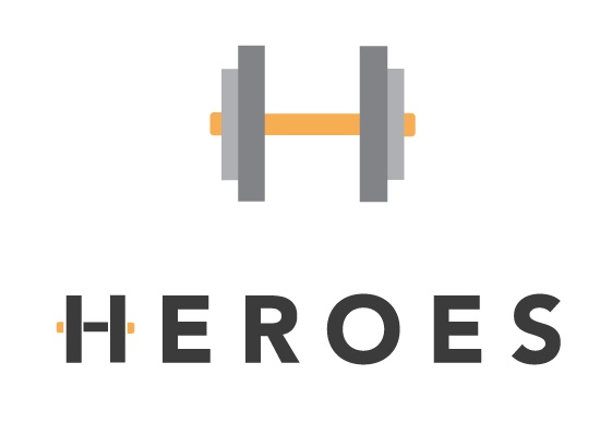
You want to keep the symbol, but there are too many dumbells in this logo. Instead of modifying the H, why not just replace it w/ the symbol?
I would be inclined to go one way or the other, rather than both. Keep in mind a one color version. Have a look at your letter spacing. Consider the weight of the center bar of the H in relation to the rest of the font.
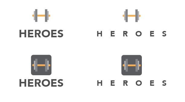
this is all the variations, i like the ones without the dark grey box. But i think just normal type is better than messing around with the H, i mean i need opinions, and i would like to say thank you to every one who has given me advice and help.
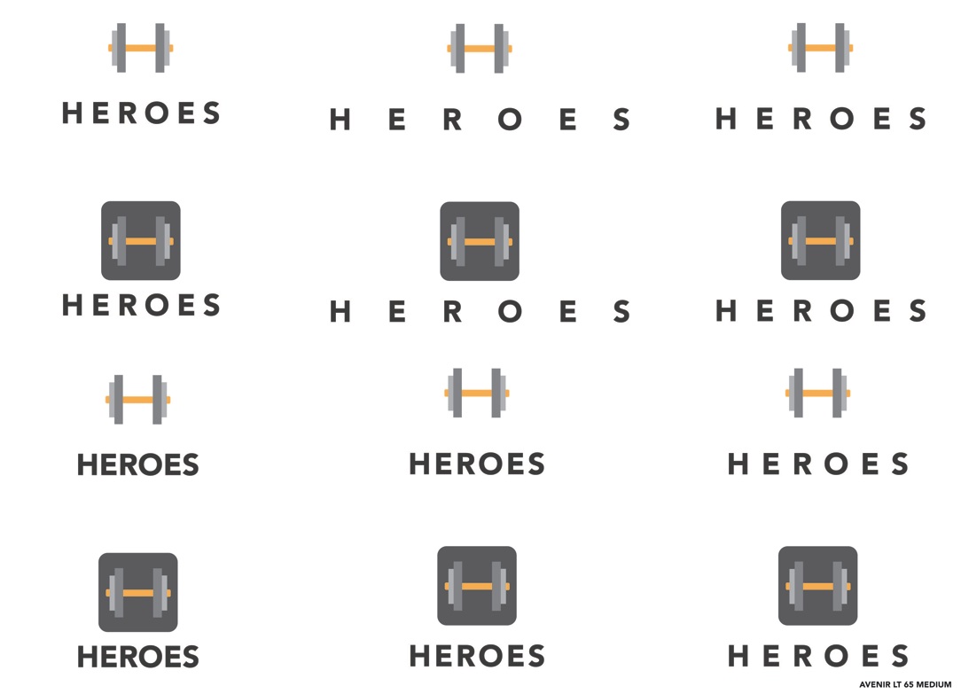

This is a good idea that needs refining. In my opinion the fastest way to a better solution is to make this black and white only - no grey. Then sort out what it looks like on a black background, and what it looks like on a white background.
You don't need the box on the dumbell, nor should you start the word with an H dumbell.
Of the logos above, top left is teh best balanced to my eye.
I agree with everyone.
how about this design? i like it without the symbol, it works well without it.
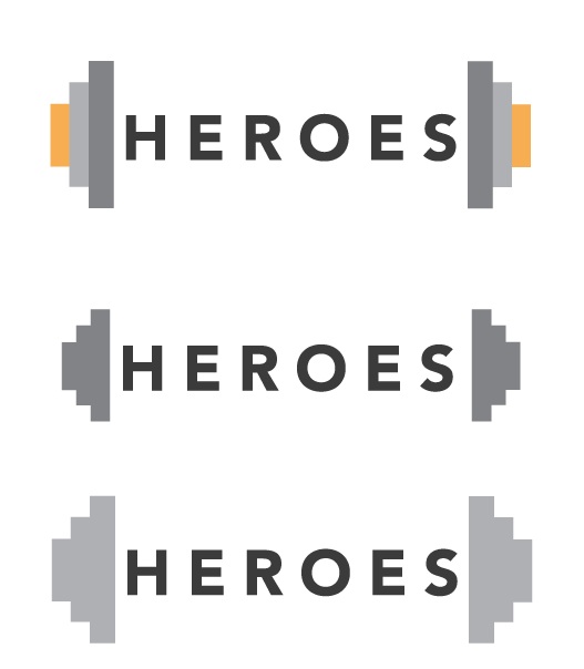
All three look rather unbalanced to me, too long and proportions are off.

This last version looks more "southwest" than "venice beaach".
I wouldn't put the logo in a box.
I wouldn't worry about putting the type under the logo.
I would concentrate on the mark.
Keep it simple.
The version posted at 10.19 (pst) has several that are good. I prefer no box and the type to be less dominant. But again, I don't think having the type weighted heavier than the logo is good.

I don't agree with everyone.
----------
Paul Ducco
Graphic Designer
Short Film Festival
The 1:50 postings are a step backwards. The weights seem more like headphones in this round. Interesting idea and it's good to test all your ideas, but the earlier posting had stronger designs. I'd like to see the type come down in size a few points to add more contrast the mark and give the overall design more interest. I enjoyed seeing your progression on this, nice work.
i will update it when i get back, but i was just wondering who everyone works for or if your freelance student etc... i'm on my final year of a graphic communication course and just want some help or direction where to go.
Think rhythm and proportion. Decide which direction you like and use the stroke widths and other elements and repeat them in building and spacing the elements. This will help things hold together and not appear to float about.
It is not unusual that you will get differing opinions and directions here. In the end it is for you to decide.
i reduced the pt size of HEROES by 6 pts

In my opinion the fastest way to a better solution is to make this black and white only - no grey.
I wholeheartedly agree here. Your issues with the form are being confused by the use of color and grayscale. Nail it down in black and white, then add color back where you want it. It helps tremendously.
As much as I love Avenir, the cap R is feeling a bit awkward. To make this work more as a logotype, I think you need to adjust it, lowering the crossbar of the R a little. I find it distracting.
i dropped down the 'r'
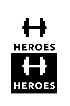
The type looks better now. The mark though still has way more of a dumbbell in it and not enough H. How about something like this ?
how about this? maybe they are spaced too far apart?
it's not bad (and certainly getting there) ... I'm still not convinced it hits the spt though. but having said that at this early hour and with a fluey head, I can't offer anything more constructive.
just throwing these out there:
it's feeling pretty clearly masculine - does that affect the female audience?
if masculine is the approach perhaps a different approach can be found ... with a different execution of the same concept ... it's just so ... plain. the simplicity is great, but the plainness is ... boring.
----------
Paul Ducco
Graphic Designer
Short Film Festival

Im thinking that H is pretty obvious so I would nix the alphaglyph (kind of like like cpalmeri) Build it directly into one cohesive wordmark. Then if you need to break it out on its own as a secondary glyph you're golden. Versus a contricting lock-up.

Thought it would like better in Antenna:

You're right about Antenna being better. I agree. But i think that this particular typface has a badly designed "S". No offence but I'd redesign it. It looks unbalanced and shape looks uneven. It jumps in my eyes...
___________
Robert Koritnik

I actually think this logo has gotten worse as the more changes you make. Originally, I thought It was great the colors worked I thought, and the way the shapes formed an H and the weight. I liked the original better. And the typesetting in the original was better to. The new version I dont like the type at all. I dont that I like where its going... The original I thought was nice.
Im going to have to disagree with that last comment. Though the colors in the original were certainly pleasing, there was discontinuity--none of the colors of the typography were matched in the mark itself. Using the same black from the type in the mark draws the two together.
Simple is harder, but simple is better.
http://incspring.com/brand_details.php?brand_id=4373
I have told the guy that it was too close, but he decided to keep the logo and disable the comments instead - http://logopond.com/gallery/detail/62634
The issue has been resolved. John ("the guy") pulled to logo as he explained in this comment.
There is an old gym here in San Jose that has a very similar logo.

I have seen this logo (or some iteration of it) several times in several different places. Here is one here: http://logopond.com/gallery/detail/62634
Though I like the general concept it would be nice to see something a bit more original. I think the concept where the barbells create the "H" is the best variation so far.

I would definitely go for the logotype concept of cpalmieri.
You can still use the H as a separate symbol in all kinds of applications.
Your logo works great in just one colour. I definitely don't like the 'wooden colour' bar.

I would drop the whole dumbell concept tbh as to me it's not really 'fitness' but more like 'macho'.
But if that is a must, I'd indeed go with the solution Cpalmieri posted.
Captured from web.archive.org on 18 Apr 2015. view this capture