
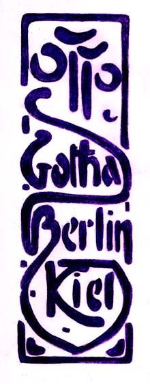
Original
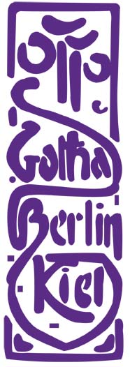
Computer Edited
Yes, I believe it’s possible to make an image better once you’ve edited it on the computer, but there is also something about an image having a human touch that it makes it a bit more personal. Drawing by hand can be really good for practicing your drawing skills, but once you have that defined, crisp image on the screen, there’s something very fulfilling about that as well. Really my image is mostly enhanced by the consistency in shading that the computer offers. You can also create edges that are more defined. I chose a typographic piece from the German Art Nouveau section in our Typology text. I really enjoyed this era in art history, and so I wanted to incorporate this into my blog assignment. This piece specifically reflects the Jugenstil (the youth bohemian style) movement in Germany and was designed by George Auriol in the year 1900. I’m drawn to the organic, flowy movement of the art. This is just one of the many examples that I wish to emulate in my own art work.
