Dear typophiles,
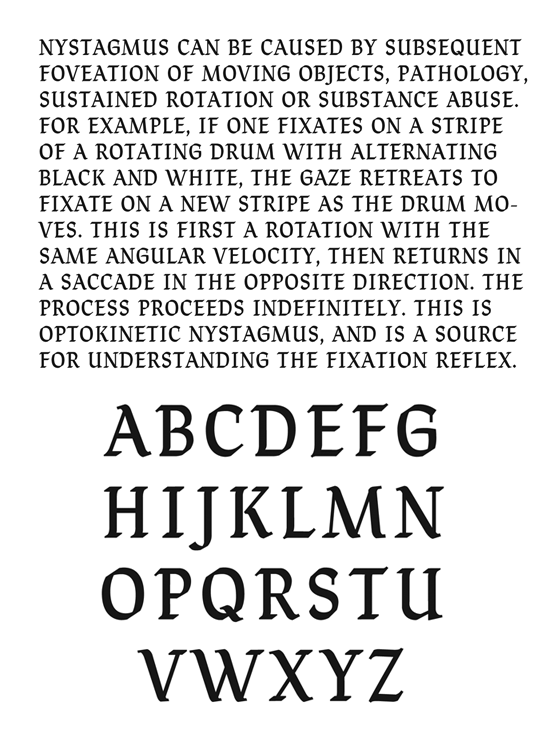
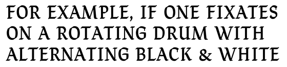
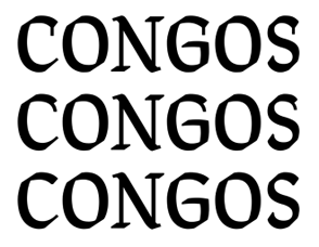
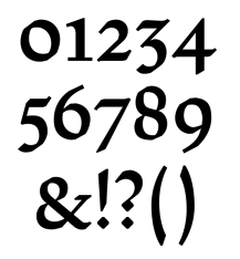
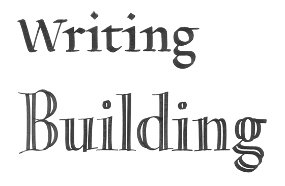
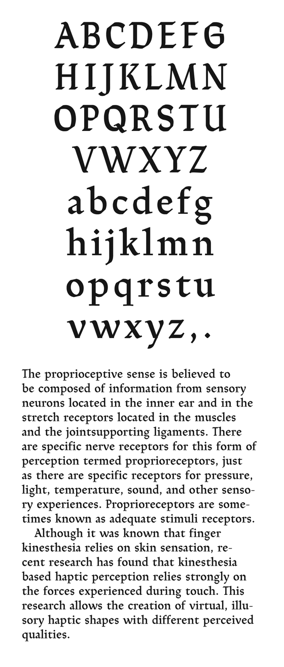
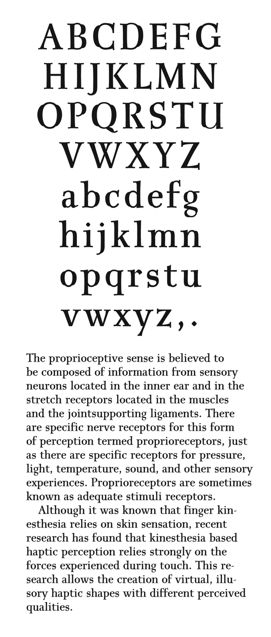
Here are two serif faces that came out of my calligraphy study with Edward Johnston's writing manual. The first type is based on his "simple-written" method and the 2nd on the "gothic" variation of the "built-up" method.
These are intended to be used for continuous text (~8-12 pt) printed on paper.
All comments welcome.
| Attachment | Size |
|---|---|
| 2009march19th-simple-written&built-up.pdf | 103.18 KB |