
It's funny how bad type stands out more once you learn about what constitutes as "bad type". The examples I have are things that I know I've seen before, but before I started taking graphic design classes, they never stood out THIS much. I had often thought that some things looked funny, but I never really thought of why they looked like they did or even stopped to think that it was a poor design piece. The, the other day, I realized how obvious bad type is to me now. I was reading this article in an "Enquire" magazine when, in the middle of reading, i thought to myself, "wow, that's bad!"

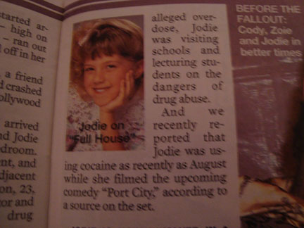
In the first image, the text is forming the shape of the picture in the middle of the text. A few of the words have horrible kerning, making rather larger spaces between each letter. In both images, there is HORRIBLE tracking with large spaces between words. It looks absolutely horrid to me. As soon as I spotted the first mistake of the article, I'm sad to say that I was half expecting to find an "orphan" at the end of one of the paragraphs. I couldn't help but wonder how someone let this article go published like that.