
Work in progress.
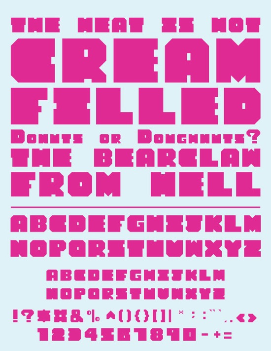
Need to definitely refine the &, ? and a few others. Let me know if anything else stands out as odd or not be working with the other characters.
Work in progress.
Need to definitely refine the &, ? and a few others. Let me know if anything else stands out as odd or not be working with the other characters.

The corners all look like they're "punked" a little, but that could be an optical illusion caused by the color contrast of the sample.
It's hard to tell the H from the N, especially at small sizes. Consider making the notches on the H wider.
Captured from web.archive.org on 14 Jul 2014. view this capture