
In another thread, James Mosley notes with respect to Cheltenham that "the type that resulted is a long way from the lively original sketches by Goodhue". I'd love to see those sketches. Are they available anywhere?
In another thread, James Mosley notes with respect to Cheltenham that "the type that resulted is a long way from the lively original sketches by Goodhue". I'd love to see those sketches. Are they available anywhere?

If they are I want to see them!

From J. Ben Lieberman's* book "Type and Typefaces":
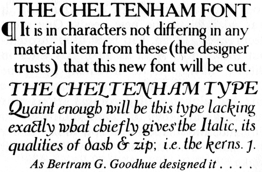
(* Our Bill Berkson's uncle.)

Beautiful. Is there anything like this available for licensing?
If that’s what Goodhue’s original designs looked like I can see why ATF and Linotype toned it down so much. This might work on greeting cards, or as a titling face (with alternate figures to keep it from getting too wonky) but as a text face it would be incredible irritating.

Cheltenham, yes, a seminal design in so many ways.
I wonder why Benton made it a slab serif.

Dwiggins was a great admirer of Cheltenham (having selected it for his subject when asked by the Eastern Paper Company to create a broadsheet specimen of his choice for them).
At one point, he toyed with his own design inspired by and based on some of the Cheltenham proportions and characteristics. In the end it came to nothing.
During the course of this short-lived experiment, C.H. Griffith sent to WAD a package with this note: "For such interest as it may have, I am enclosing a photostat reproduction of the original Goodhue drawings of Cheltenham. These drawings were subsequently modified by Morris Benton, resulting in the present Cheltenham Old Style letter. Benton's drawings were used for our cutting."
To this Dwiggins replied: "The Goodhue drawing most interesting -- shows that he was a better architect than he was type-designer."
-- Kent.
Do we really know that the toned-down slab design wasn’t done by Goodhue? Is the image above from a drawing or is that the Cheltenham press version? The Linotype version is very similar to the ATF version, so it could be that both versions descended from the final metal weights by Goodhue. Of course ATF and Linotype could have been cross licensing from each other, it’s not like anybody kept records of that stuff…

Re: the text, I guess his trust was misplaced! Doubly sad, because the guy was so honest that he didn't even kern his drawing! (CHEL TENHAM)
I think the signature rounded slab serifs it ended up with would have been created at the stage of large-scale drawing for big type.
At the time, that would have been for foundry type, as hot metal didn't go large enough to warrant that subtle an attention to detail.
James -- in case you missed it, as CHG says in the note that I quoted above (probably while you were posting), Mergenthaler Linotype used Benton's drawings for their version.
I would guess that it's a drawing, not type. There is a lot of variation among the a's, e's, and other repeating letters. Notice how some of the e's are closed and some are open (as in the final Cheltenham Old Style Italic).
I think it's interesting that he uses "font" and "type" interchangeably.
Nick -- I'm not sure why you're referring to Benton's cleaned up and regularized Cheltenham as a "slab serif," or even a "toned-down" slab (as James qualified it). The original ATF Cheltenham shows, for the most part, rather thick, stubby, and heavily bracketed serifs. Not quite as filled-in on the hard stock of the 1923 catalog as the somewhat fuzzy reproduction that Mark posted, but still, not what I would call slab.
I think it’s interesting that he uses “font” and “type” interchangeably
He may have preferred font but needed type's 'p' for his pangram attempt! ;-)
I’m not sure why you’re referring to Benton’s cleaned up and regularized Cheltenham as a “slab serif,”
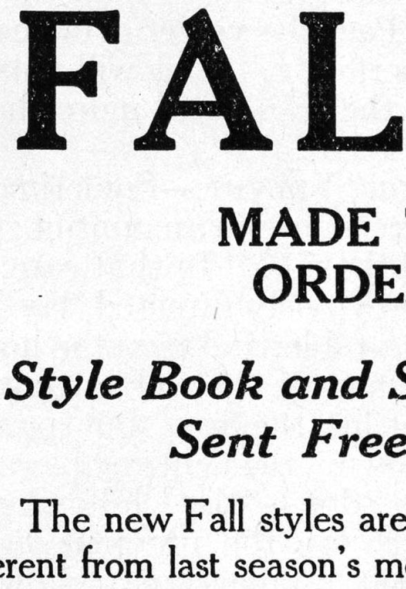
It's a low-contrast face with thick serifs, so that's what makes it a slab, IMO. The roundedness of the brackets is so slight at text size, given the stubbiness of the serifs, as to not be much of a feature. However, the novel "s" shape of the bracket is quite distinctive at display size.
Thanks Kent. Your post appeared after I wrote mine.

I call those Doric serifs.
hhp
Okay, Nick. I suppose it's a matter of semantics. I consider the Cheltenham serifs more of a Clarendon structure -- bracketed, low-constrast, squarish ending. I suppose some consider Clarendon a slab-serif. But for me it doesn't become slab until there's no bracketing.
I'm not contesting the essence of your point; clearly Benton shifted the design toward a low-contrast finish even while trying to maintain Goodhue's underlying letterforms.
I think it's a little misleading, though, to compare the later Cheltenham family additions as the Benton characteristics became more pronounced as the family developed, especially in heavier wider styles.
I think the original Oldstyle actually retains a fair amount of Goodhue's quaintness.
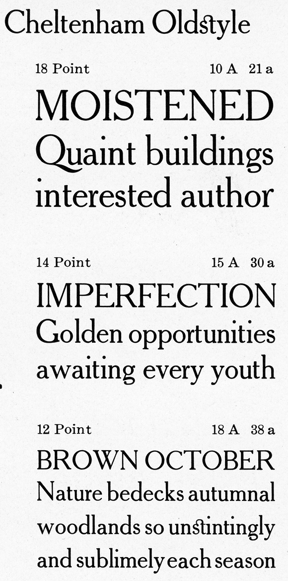
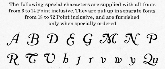
And a handful of the quirkier italic forms were offered as alternates (but not that funky lc. delta d):
Captured from web.archive.org on 14 Oct 2013. view this capture