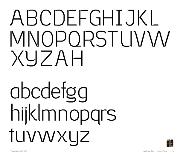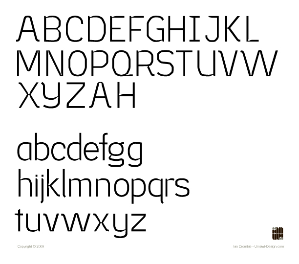
Royal Atlas is the title of the project I am working on for my senior show. It is, in summary, a luxury airline. To create a strong brand I decided to craft a custom typeface.
I wanted the type to have two lives, so to speak. One as a display face where its 'diamondy' edges, irregular curves and ink wells shine. The other as a text face where all those elements become less prominent.
The type is at a point now where I need to fix some of the quirks that are not working and refine any flaws. I would greatly appreciate if you could take a look and tell me what you think. Any and all feedback is welcome.
To start things off I've attached the alphabet.
Thank-You
-Ian
| Attachment | Size |
|---|---|
| RoyalAtlas_Typophile_Crit1.jpg | 684.8 KB |
| RoyalAtlas_Typophile_LargerType_Crit1.jpg | 299.66 KB |