

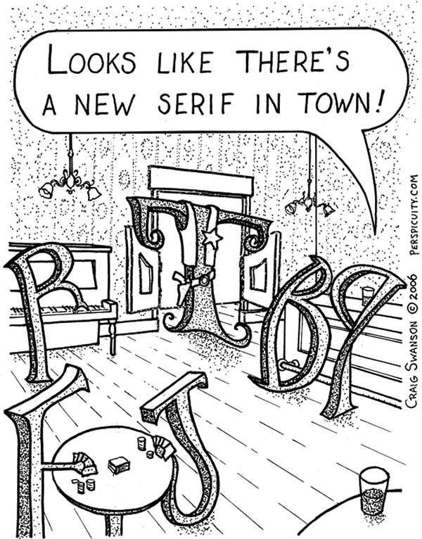
Making this was inspired by a comment by Nina Stoessinger from another thread. Whoa - an undead font sin from the past
ChrisL
Making this was inspired by a comment by Nina Stoessinger from another thread. Whoa - an undead font sin from the past
ChrisL

"With catlike tread..." started to float through my head. Perhaps in relation to all the recent pirate vs ethics threads? Nice work Chris.

Yep, a policeman's lot is a happy one!

We are at Dezcom One! Call out the type police!!!!
Someone has stolen facets of the appearance of the Typophile site
Is anyone else having malfunctions?
Michael
Edit: And my mouse is misbehaving. Sorry for the double post : (
Michael

What a cop-out, Chris.
Just don't let Uli see that copyright symbol!

Ha, thats funny Chris! About two years ago I bought the domain typografipolisen.se, which is exactly that – TypePolice – in swedish. Don't know what to do with it quite yet, but perhaps one day I will figure it out. At first I wanted to blog about those poor logos and conceptual typefaces without any optical corrections at all in them (often made by art directors, not letter drawerers), but in the end I didnt want to be that person who points out errors in other peoples work, so I gave it up ;-)

I once had the honor, if that's the right word, to serve as the treasurer of the Society of Printers in Boston. Apart from maintaining the inventory of the bar, the treasurer's principal duty was to distribute a printed report of the Society's finances after dinner at the Annual Meeting.
When dinner was done, the members launched into the traditional critique of the Treasurer's Report. Mind you, no one paid a bit of attention to what it said about money. But woe to the treasurer whose column heads weren't centered properly, or whose kerning was imperfect. It was truly a case of Type Police Brutality.

:-D
Great stuff, Chris. I feel honored. :->
This reminds me of http://www.design-police.org/

Why do I feel a type fireman, type chef, type doctor coming on? :)
Actually, I think what we need is a type dezcom singing opera!

shouldn't that be Typolice
-=®=-
Then we could all get de-loused ... and be done with it.

In French, police de police?

[Source]
Bob Marley shot the old one.

first crime call

>crime call
Arrest "Flash" not Dezcom!
Flash claims ignorance, saying he doesn't know from "smart quotes" :)

Actually, "The TypePolice" is also written in HTML.
I think it’s time for serious internal investigation! :-P
Flash Crime!! to the tune of a famous Eurythmics song!

@Goran,
"I didnt want to be that person who points out errors in other peoples work, so I gave it up"
I don't blame you. It is like being a professional bitcher. I was looking at this as a humorous way to take a gentle poke without being taken too seriously.
ChrisL
@Russ,
With my pathetic spelling and even worse typing skills, I dare not use the term Typo :-)
ChrisL
@Mike,
Typecrime
Typecrime
Nineteen eighty four...
ChrisL

> like being a professional bitcher.
Chris -- perhaps you are familiar with Kvetcha Yoga: purification through bitching ;-)
Oy Vey! You should only do such a thing, just a small mention of a mere inconvenience and you call kvetching already! :-)
ChrisL

Typecrime
Typecrime
Nineteen eighty four...
So... it's off to the Ministry of Type with you, mate!
"The Ministry of Type was the really frightening one. There were no windows in it at all. Winston had never been inside the Ministry of Type, nor within half a kilometer of it. It was a place impossible to enter except on official business, and then only by penetrating through a maze of barbed-wire entanglements, steel doors, and hidden machine-gun nests. Even the streets leading up to its outer barriers were roamed by gorilla-faced guards in black uniforms, armed with jointed truncheons."
(This is Orwell's description of the Ministry of Love, but I've substituted a couple of words!)

Kvetcha Yoga: purification through bitching Hilarious, kentlew!
Dez, would the character's name happen to be Bobby?
You betcha, Bruce, but not Bobby Slimbach :-)
ChrisL

My girlfriend would like to know if there’s a text offenders register??!!!
Stef
Yes, you have to put a poorly written sign on your door :-)
ChrisL


Guerrizmo+Design

This one is serious! Do ‘ears’ start with an ‘e’ in Spanish?
Nope... "ears" in Spanish is "orejas".
Is Policía the same in Italian?
ChrisL
Polizia in Italian.
Grazzi!
ChrisL
I hope you guys and gals like my version. I was inspired by ChrisL type cop.
This is what the type police south of the border looks like.
Creative people all over Latin America
take their type serious just as much as North American's do.
Spanish+Italian=Romantic Language
Guerrizmo+Design

“
Shot! Shot! Shot!
Aggggghhhhhhhhhhhhhh.... .... ....
”
Where is the Typolice when you need it?
http://www.weatherby.info/shazam/generalrubbish/PirateDog.jpg

Hi Typophiles,
My blog is actually called Type Police!
Its funny to see this compositions, I have been working on a logo/masthead for my blog but it is nothing like this.
Anyway this is awesome, good idea!
Well, now you can check the Type Police blog, its kind of a new blog, so there's not much in there. Thinking about showing all those crimes to typography that go unnoticed or unpunished...
http://typepolice.wordpress.com

On a side note, I designed a T-shirt for the plagiarism police ; the making was inspired by a faculty meeting…
Alessandro, that is funny! What is the story behind it?
ChrisL
Thanks for chiming in, Juan. I assume you teach typography? It looks like some good projects from your students.
ChrisL
Chris,
Well, I'm actually taking the Advanced Typography Certificate at the Langara College in Vancouver, BC. This program has been put together by Dr. Shelley Gruendler of Typecamp http://www.typecamp.org/
So all the exercises are made by me...
Cheers,
Hi Juan
Im also named Juan and your blog is interesting.
Where you from Juan?
Alessandro, I dig the t-shirt.
Guerrizmo+Design
@Juan, Shelley is a very fine typographer. I am sure you learned a great deal.
ChrisL
Chris, plagiarism was one of the 7/8 topics covered at the semester faculty meeting; now it appears we have a committee (a group of four colleagues) to deal with such matters – especially for interior architects and fashion design students, for their paying someone out of the school to make their modelling, etc.
Anyhow, my T-shirt is what you see it is (with the quote from Malcolm X), and only for fun, yet I whole heartedly agree with Professor Aaron M. Brower when he says that "students must read for knowledge and write with the goal of exploring ideas. If students developed a genuine interest in their field, grades would take a back seat, and holistic and intrinsically motivated learning could take place. Source: NYTimes.com
Captured from web.archive.org on 9 Nov 2013. view this capture

