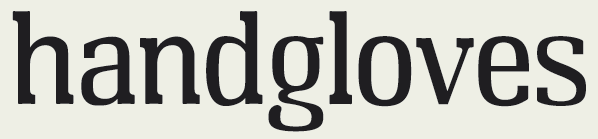
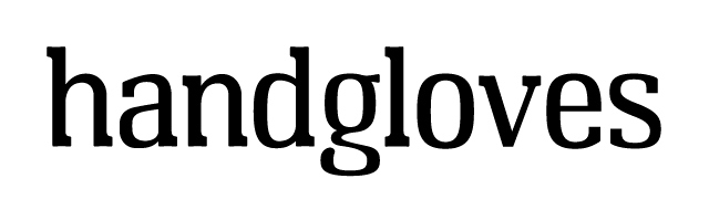
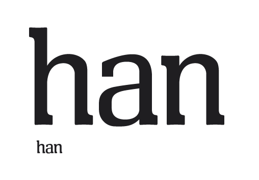
OK, after too long sketching and thinking about this, I finally got Karen Cheng's book "Designing Type" a while back, and then had a coronary when I realised exactly how involved it is to actually digitise letterforms. After working as a small-time designer for several years, I recently realised that I'm addicted to type - but didn't truly appreciate the craft of type design.
Anyway - long story short, I have spent the last few days in drawing some letterforms and already (having printed them out at various sizes) need some feedback (e.g. give it up, and stick to your day job Steve).
My intent is to produce a reasonably tight design, that would be useful for display, headings, and short runs of body text. I have always leaned towards sans type in my design work, so want to produce a serif that is clean, with serifs that are quite deep, yet slim, producing something that looks more geometrical without being distractingly so.
Thanks for any feedback.
Steve
| Attachment | Size |
|---|---|
| Just.png | 5.9 KB |