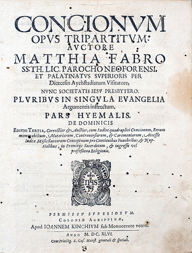
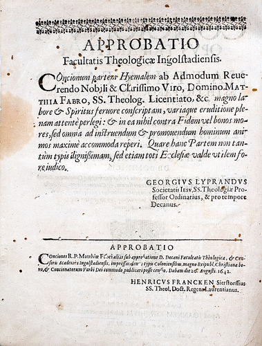
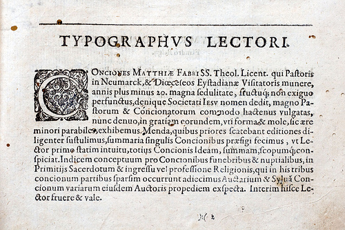
Hello typophiles. First sorry about my bad english. Recently I bought on an eBay auction, the book Concionum Opus Tripartitum. It was printed in Cologne by Johannes Kinchius in 1646 . The typefaces used in this book intrigues me. I can found 3 different styles. Roman, italic an a fraktur. The roman and italics used in text looks like a Garamond (or like) cut. I'm right?
For bigger images please check my Flickr