Hi all,
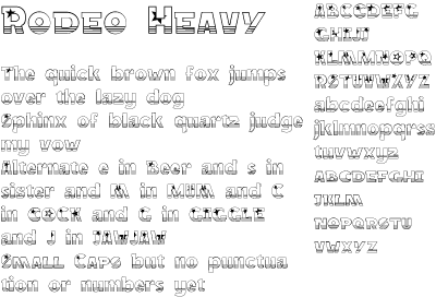
I'm drawing glyphs for a stars and stripes font that started off from an entry for the type battle. I'm still very new to all this, so I'd really appreciate any advice or critiques that you can offer.
Specific points: do the uc and lc go well enough together? Would it be better without the stars - or with them kept as stylistic alternates perhaps? How about without the stripes? I'm not sure I like how the descenders look, going clear again below the stripes.
| Attachment | Size |
|---|---|
| Rodeo_Sample_0.100.pdf | 241.09 KB |
| Rodeo_Sample_0.100.png | 14.36 KB |