
Wondering what the serif is. Probably really obvious... but I can't seem to ID it.
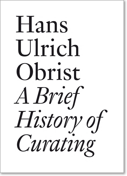
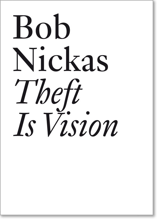
More samples: Documents Series.
Wondering what the serif is. Probably really obvious... but I can't seem to ID it.
More samples: Documents Series.

The 'a' and 'N' is a but wacky to me. You sure it's not customized?

Looks like a Fleischmann revival. But which one?
Stephen: I've no idea if it's customized or not.
Jan: Yeah, WhatTheFont did spew out a few Fleischmann's, but not this one.

The italic "y" is very unique, with the descender out of the left stroke.

that "y" looks like DTL Fleischmann but the serifs on the caps (even the display caps) are different. I agree with Stephen..the N & the a look way out.
I think that N is fantastic! :)
The a does look a bit like the odd one out -- compared to the other Fleischmann's out there -- although I think it's not really a problem.
I will e-mail the publisher / designer about it later today if no one can find it here. :)
Doesn't happen often that there is no ID on the forum :P

This is an odd creature. Many of the letterforms seem like Garamond to me, particularly the 'a', but that 'y'seems to be only in Fleischmann. There are four other fonts that Yves once wrote were based on Fleischmann: Mercury by Schwartz, Farnham by Highsmith, Fenway by Carter, and Eudald by Feliciano. From what I could see of them, at least the first three do not have that italic 'y' (I did not have an italic sample for both Eudald versions).
This seems like a new font to me, so I will be curious to hear what you learn from the publisher.
- Mike Yanega
Mercury by Hoefler and Farnham by Schwartz, that is ;-)
LOL..I'm curious too! The "odd-ness" is beginning to grow on me...:)
Jan, Of course, you're right. I wrote down the font names from Yves article, but didn't write the designers. I recalled badly, as often happens at my age.
- Mike Yanega
I have e-mailed the publisher about this one. I'll post later if I get a reply.
@Mike: yes, some of the letters remind me of Garamond as well. I would be surprised, though, if this would turn out to be a hodge-podge.

Who is the designer?
I e-mailed the publisher, and he told me the typeface is called Genath, designed by François Rappo, who also designed La Police BP.
I can't find anything about Genath, though, so it might be that it isn't available commercially (yet).
Rats... Keep your finger's crossed:D
I tried to post on this a few days ago, and I see it never made it (my internet connection has been flaky recently). In an odd (probably not) coincidence, François Rappo has designed fonts for Optimo, and Optimo has a serif family called Stockmar that is based on a design of Johann Rodolf Genath, done by Matthieu Cortat. One of the italic versions of Stockmar has a y quite like the odd one we have been commenting about. I have samples in my Serif Font ID Guide. You can search by designer, as well as font name.
- Mike Yanega
I should add that Stockmar is NOT the font we have been looking at. The serifs are quite different for one thing, but there is a sort of family resemblance.
- Mike Yanega

Very zainy lowercase a kinda rocks. I love the lowercase italic g— very sweet.
LOL @ Mike...I went to Optimo too! But it was based on the face that publishing company's logo was in Didot Elder...I thought why not give it a try..but of course..there wasn't a match.
Thanks Mike, that Stockmar is interesting. Especially the resemblance in that italic y is nice to see. I think Genath is more balanced and refined though.
Let's hope Genath will be available for license someday, it's definitely a typeface I would use.

Genath is my free, simple rendering of a baroque type from the Genath Foundry in Basle, Switzerland. It's based on a 1720 specimen likely showing Johann Wilhelm Haas first design in Basle. Haas, Basle, the foundry produced two centuries later a better known typeface.
Like JM Fleischmann, JW Haas (1698-1764) was trained in Nürnberg, probably by Johann and Pankraz Lobinger. Both Fleischmann and Haas epitomize a consistent typographic style, specific to Northern Europe. Spreading from Prague to, some extend, London. Truely ‘baroque’, slightly condensed, highly contrasted, with playful, fancy details.
(All my informations about Genath and Haas come from: Albert Bruckner ‘Schweizer Stempelschneider und Schiftgiesser’ Benno Schwabe, Basle, 1943.)
Genath is still a private font, but following the interest of Gilles Gavillet and David Rust (Optimo, Geneva) the designers of the JRP Ringier book collection, I will probably release it in a near future.
-François Rappo
François>>>
I love your La Police and Genath is truly special as well. It happens to function well at both at display and text sizes.
Congrats and I {we} look forward to when you release it for mass consumption!
Mikey :-)
Thanks for the infomation François. I should have linked to this thread in the short e-mail correspondence I had with Gilles Gavillet, which was CC'd to you. I forgot, but good to see that you found it.
Just as Mike above me, I'm looking forward to when it is released as well!

Anyone knows when will Genath be released? I'm looking forward too...

Genath is available now.
http://www.optimo.ch/typefaces.html
Captured from web.archive.org on 10 Oct 2013. view this capture