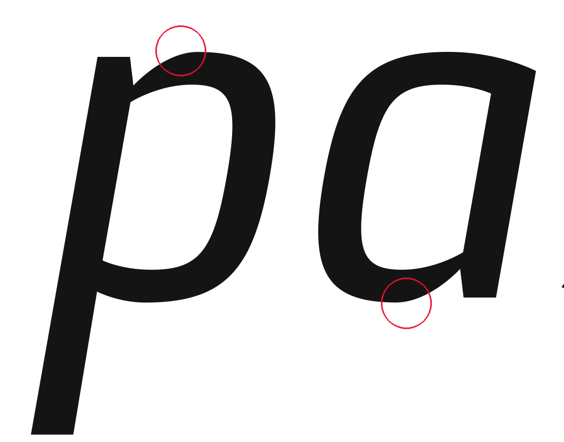
I've been designing fonts for about a year now, pure hobby. I've always felt that, because I was never properly educated in type design, I'm missing out on a lot of stuff. Nevertheless I try. In the last weeks I've come up with this design, inspired on the beautiful typefaces by Gerard Unger. Like his type, I'd like to give it a feel of (post) modernism and clarity.
Like I said, I'm not a professional, not even an educated type designer. However, I'd like you all to comment, good and bad...
Thanks in advance!
| Attachment | Size |
|---|---|
| Gerard 3.0.pdf | 221.26 KB |