I'm a noob.
Btw.
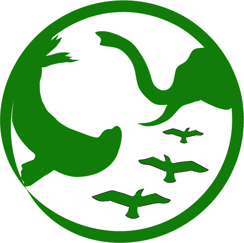
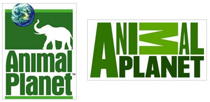
In school, I was assigned to pick a logo that we didn't like. (I choose Animal Planet becuase they recently changed the entire identity of Animal Planet, and the new logo is horrid.) I've been working on this for weeks, but I still don't feel completely satisfied with it. I almost feel like there is something missing... Any suggestions would be grand.
Ill post all three logo so you can see the evolution..hah
P.s, my illustrator skills are limited so there are lines around my birds... they are not gonna be there when I tweak it.