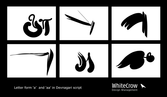
I have worked on Devnagari letter form अ and आ. These are a part of exploring the form assignment.
| Attachment | Size |
|---|---|
| WhiteCrow.png | 34.42 KB |
I have worked on Devnagari letter form अ and आ. These are a part of exploring the form assignment.
| Attachment | Size |
|---|---|
| WhiteCrow.png | 34.42 KB |

Looks nice and casual, though I am not an expert on Devanagari. And I guess the text is in Marathi, which is even more alien to me. It is high time we make casual and non-formal typefaces in Indian scripts and bring in some much-needed vitality into the scene.

That is really beautiful. I cannot read any of the Indian scripts (except those based on Arabic) so I see your font as pure abstract calligraphic shapes. Inspired by a particular style of Japanese calligraphy I developed my own style of brush-drawn Arabic, and some of my shapes resemble some of the curves in your font. Can you please display some large close-ups of a few words or letters with your font? I want to see how you treated the lines - strictly monoline (same width) or modulated. If modeulated what criterion did you use to decide where it should be thick and where thin?
Captured from web.archive.org on 12 Oct 2013. view this capture