
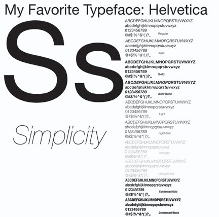
Helvetica, a reworking of the typeface Neue Haas Grotesk, was designed in 1957 by Max Miedinger with Edward Hoffmann in Switzerland. It was originally created to compete with another sans-serif typeface, Akzidenz Grotesk, and quickly succeeded in becoming one of the world's most popular typefaces. Helvetica is perhaps the most widely used typeface in signage and logos. Its large x-height and easy legibility makes it ideal to use on street signs and in the corporate world of advertisement. Helvetica is also responsible for furthering the popularity of sans-serif typefaces, which were just beginning to be used around the time of its creation.
When I choose a typeface to use in a project, I consider two things: the first is the purpose of the project and the second is legibility. Maybe its from growing up with two parents who are doctors and have horrible doctor's handwriting, but I hate having to work to make out what something says. I think that if a designer takes the time to write something (and this of course has exceptions depending on the purpose of the project) it should be able to be easily read by anyone who can read. And even for people who can't read, it should look aesthetically pleasing to the eye, as if it belongs on that street sign, label, heading, or billboard.
Helvetica fills all of these criteria for me. The fact that it has so many different styles within its family makes it useable on almost anything modern. It is possible to make a design project incredibly interesting while using only Helvetica because of its many styles. I also like that it is clean, modern, and easily readable. Because I use Helvetica so much in my projects, I try not to go to it first when I am choosing a typeface. However, it is comforting knowing that it is there and almost always sure to work if nothing else does. I guess you could call Helvetica my safety net. If I had to pick a favorite letter in this typeface, I guess it would be “S” because of its clean, curvey lines. It just seems like a good example to me of how clean this typeface actually is.


