
I'm curious..it's not BUTT ugly like Comic Sans, but it ain't pretty either..and it's also just about anywhere and everywhere. Does anyone know why? Or is because of Windows and Microsoft?
Thoughts please..
This thread ran to 2 pages of replies and only one was recovered, so replies are missing.
I'm curious..it's not BUTT ugly like Comic Sans, but it ain't pretty either..and it's also just about anywhere and everywhere. Does anyone know why? Or is because of Windows and Microsoft?
Thoughts please..

http://twitpic.com/18mpj - I hate Times New Roman. Letters by Vincent Connare and image by AMP London. Released in 2003. about 2 hours ago from TwitPic


Yeah, children are silent.
hhp

>Does anyone know why? Or is because of Windows and Microsoft?
Times was selected for the first laser printers - so Adobe is to blame ;-)

When Times Roman was introduced in the 1930s, it was a breath of fresh air. It had a narrow shape to fit well in newspaper columns, and a generous x-height for ease of reading. With its oblique stress, it was much easier on the eye than the newspaper types it replaced, variants of the Scotch Roman family with vertical stress, wide serifs and exaggerated contrast between thick and thin strokes (this example is from the London Times in 1922).
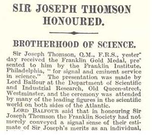
That being said, I agree the guy who combined Times with Comic Sans initials ought to be waterboarded.
"Like Helvetica, Times is a perfectly good font that was undone by its own success, reduced to the visual equivalent of white noise."
I agree..it's not THAT ugly, but it's everywhere and it's ubiquity makes it a pain really. The van should be burned:P
Just thinking, after reading the "wiki" article. WHY does it have to be the default font? Why couldn't they use something else... I try to use Georgia instead of Times when faced with no choice.
What would you suggest they should have picked? Georgia wasn't released until 1996. And what's to say the default wouldn't have become as over-used and tired as Times and Helvetica?
I don't know really. Helvetica IS tired, but somehow it's managed to keep going, with people declaring their undying love for the typeface, even a film now. Maybe there will always be a use for similar grotesks. BUT, I've not heard of anyone expressing such sentiments for Times New Roman. Not yet anyways. I'm just lamenting the fact that it's everywhere...
The popularity/over-use of a font has only partial relevance to its functionality. Times came out OK in the printing of early 20th century newspapers, but now it's too light and too contrasty. There's actually a nice demi weight of Times, but it's a rara avis. As for Helvetica, its various parameters (vertical proportions, weight, spacing) are out of whack with each other, so it has never really worked well (with the possible exception of the hairline weight at very large sizes). People tend to like Helvetica because they take their particular pet ideology too seriously, subverting the world to it.
hhp
Agreed that Times looked alright then, and that's its digital version is woeful. Not exactly ugly, but its the overuse that does it in for me. I'm curious as to whether the overuse is due to lack of alternatives, or just pure ignorance?

Overuse comes from availability (or lack of availability of alternates). But I think ignorance and lack of critical thinking definitely plays a role.

Tracking.

It's everywhere because...it's everywhere. 3M uses it, along with Helvetica. Why? My guess is that they save a chunk of money in font licensing. Silly thing to scrimp on, IMHO, but...
My current gig is 'Helvetica'. Unless you don't have it. Then use Arial.
*sigh*
I don't actually dislike times for what it is good at. I mainly dislike it as when I've had to use it...it was usually in the wrong medium as a display face, or screen face. Both of which it doesn't excel at.
But what is Times good at now?
Besides saving money and mental effort.
hhp
TNR, what is it good for...
Might be a question for Font Bureau... http://typecon.com/talk.php?id=258
TNR what it's no good for... the old Ministry of Sound logo... I replaced it with a more contemporary version
and 'Everyone knows comic dogs don't talk in TNR'
http://crackle.com/c/Rocketboom/Vincent_Connare_The_Creator_of_Comic_San...

Times New Roman was and is a great typeface. It deserved its popularity. Get over it.
Now I know a good replacement that ought to be everywhere soon ... :)

I agree that it was a great typeface. Because of overuse, I never use it. I've been sending out a newsletter for about 9 years. This is what I tell prospective subscribers:
[My newsletter] is also a workshop and playground for my typographic and writing interests, and a demonstration that there is life (at least in print) after Times New Roman & Ariel, neither of which are used in this newsletter.
Each issue is printed in a different pair of fonts, complemented with display fonts appropriate to the copy of a particular article.
What's the newsletter about? Proof reading? ;-)

NOT WANTED!
@ William - what replacement? (I'm curious) I've taken to using Storm's Lido when faced with stubborn resistance! Interested to see Starling from FB
@aluminum - I know how that feels, having to use it for silly purposes. TNR for logo(sigh) "Could you make that bigger?"
When I was a kid I was head over heels for TNR Bold Italic.
On the one hand, TNR really *is* a great typeface. When the "Times conspiracy" stuff was first big I spent some time really studying and re-evaluating Times, and decided it is really a great piece of work. Sure, it's overused and I'm tired of it, but the design is really outstanding.
On the other hand, I couldn't agree more with Hrant on Helvetica. Pretty much everything good or useful about Helvetica is all in the associations or image it brings along, not in the actual design or inherent utility of that design. Bleah. But I still have the movie on Blu-ray. :)
Cheers,
T
Haha..in the case above..fair enough. It was used well..and I guess it wasn't expected either..nice nice. This I think, is true typographic craft, to make something not spectacular turn out to be quite sweet!
sii (Simon Daniels),
OK, I give up. What was my error?
BTW, "Proof reading" is one word.
Playing gotcha is not without risks.

The typeface you are seeking to avoid is called Arial, not Ariel.
Yehan (Mark) that was an inside joke about my forthcoming new text Caslon. It's actually not going to be in the same 'space', as it is not so condensed as Times New Roman. I have tried to make it better for many uses, but certainly not for all.
What Times New Roman did better than any previous face was to cram more letters into the line while remaining very readable, and also achieving a crisp, modern look. The trick, which according to one story was Stanley Morrison's idea, was to put the sharp, lapidary serifs of Gill's Perpetua onto Monotype Plantin. This concept--very well executed by Victor Lardent--made Plantin look more modern and crisp. (There is an alternative theory of the origin of Times Roman, which may be true, but this one reveals what is distinctive about it.)
Times Roman shines at small sizes in narrow columns, and in small format books. The main weakness of Times New Roman to my eyes is that it is a trifle too condensed and dark.
It is severely compromised with normal margins on letter sized office stationary. At sizes that are good for Times the measure--line length--is too long for comfortable reading. In that sense it was not a great choice for computers, as most of the output from computer goes onto letter sized paper. But it is still one of the great faces of the 20th century.
Of course it is so ubiquitous that if you want a fresh or distinctive look, it is much easier to go for an alternative. Still, good designers sometimes figure out how to make it look good and fresh again.
@W. Berkson, with a nod to R. Man: Only one "r" in Stanley Morison.

Times, used well:

ROFLMAO... a bit off topic but
I saw that van with the Comic Sans and TNR - sublime, and poignant... Driving home today with my wife in the car, and she pointed out the new sign outside a hotel for which I had designed a logo a couple of years ago...
It had lovely flowing swashes linking two word forms, and now their new sign has the logo with their web address bolted to the top of the swash links, probably using "fit text to path" in CorelDraw... I saw CorelDraw as that is what signwriters use around here and only a signwriter could destroy a perfectly lovely logo by sticking a web address in small sized arial along elements of the logotype!
I say there should be a thread here showing how logo's have been later destroyed by well-meaning third parties.
Marcox, would I be wrong to observe that the leading on those sub headings is a bit tight? I have to say though, it's nice to see serif faces on the web, even TNR at larger sizes.

Well, we've got the other "common" font, Palatino, which seems to get underused. We've got the Nova version now, but I've always liked the old one.
TNR is overused, but it's really beautiful, and to be honest, it excels in efficient, legible use of space while maintaining a formal appearance. It also helps that TNR is essentially freely available. If someone were to release a similarly compact, efficient, formal text type that is widely and freely available, my guess is that would take off as well. There are alternatives, but they don't have all those characteristics simultaneously.

I think it's more the abuse of TNR that I hate. When used terribly by people that don't know any better, simply because it's the default on Microsoft Word, it's bound to be misused the most of any other fonts.
>it’s the default on Microsoft Word
No it's not.
Cheers, Si

Times Roman may be the wonder of the modern age, but it doesn't work for signage. It doesn't read well from any distance. In three dimensional signage, unless cast in metal, it is a class A pain in the tail. The bold is no help at all. And, if I hear one more time "can't you beef it up?" I'm going to loose my lunch.

Huh? But why should it? Signage typefaces are in a league of their own—like, say, typefaces for the screen, for the phone directories, for classified ads, etc. There are a few custom variations of Times New Roman—and Times Roman (those are different typefaces)—created for specific purposes and uses, like Semibold, Claritas, Series 569, Seven, Medium, Small Text, Ten, Eighteen. What would be wrong with developing a special version for signage?

The original TNR was (of course) conceived for use by the newspaper. Which was a very upmarket newspaper at the time: twice as expensive as the rest, printed with great care on superior paper. The combination of all this resulted in a very nice looking product, which showcased TNR to the fullest.
Later usage has done a lot to diminish this high quality image. And the first digital versions were pretty awful, imo.
It may be just the moment for TNR to make a come back...
. . .
Bert Vanderveen BNO
What would be wrong with developing a special version for signage?
I'm working on it...
Oh help..I'm not sure I'm ready for a "signage" version of TNR. I think it's case of usage. I don't appreciate the abuse (of the font and my eyes) but I agree TNR has its charms.

Sii: "TNR, what is it good for...Might be a question for Font Bureau... "
We have this currrrrazy hardwiring in our corporate dna that says, if a font was good, great or gorgeous 20, 30, 50, 100, or 200 years ago, there's a reason. :)
The opposite of that, I s'pose, would be that if a font is delivered to millions and or billions of users and it remains generally under to un-used, it must suck. ;)
Cheers!
I don't like it in signs either. It is a text font and that is how it should stay. The problem is that most clients don't agree with that opinion.
But most clients don't even know what text really means.
(Actually, too many type designers don't even know!)
hhp
I stand corrected. It has been a while since I've been on Microsoft Word.
Now I remember that it was just required by teachers in our school district. They required everything to be in 12pt TNR "double spaced" in order for them to gage the length of papers and a sense of uniformity. Strangely enough, it would not surprise me for that being partly responsible for such a gross use of it.
@dfboyd: Asked Vincent "Comic Sans Designer" Connare at ROFLthing: "Is Helvetica cool again? And is it because of that movie?" (A: "Yes, and Yes.")
Helvetica is cool again.
but Comic Sans is such a laugh you gotta love it. It's feck'n funny as hell.. nothing brings out the emotion like the dog in ya.

I designed our church's new sign at one point; gave full specs to the sign shop as to what fonts to use etc... they went and did it in TNR (without giving us any chance to proof before making the final signs!), and as a result, it's virtually unreadable from a distance. To add insult to injury, shortly after the new sign was installed, before we could do anything, the company went out of business. I cringe inwardly every time I see this sign. And since I'm the pastor, I'm there almost every day...
Proof that God has a sense of humor, and is a typophile!
Jop Van Bennekom manages to make TNR look smart and sexy in his Fantastic Man magazine: fantasticman.com
Captured from web.archive.org on 4 Apr 2015. view this capture

