
It's a disgusting typeface,I know, but could any of you guys give me some pointers on strenghts/weaknesses, so that I can improve it??
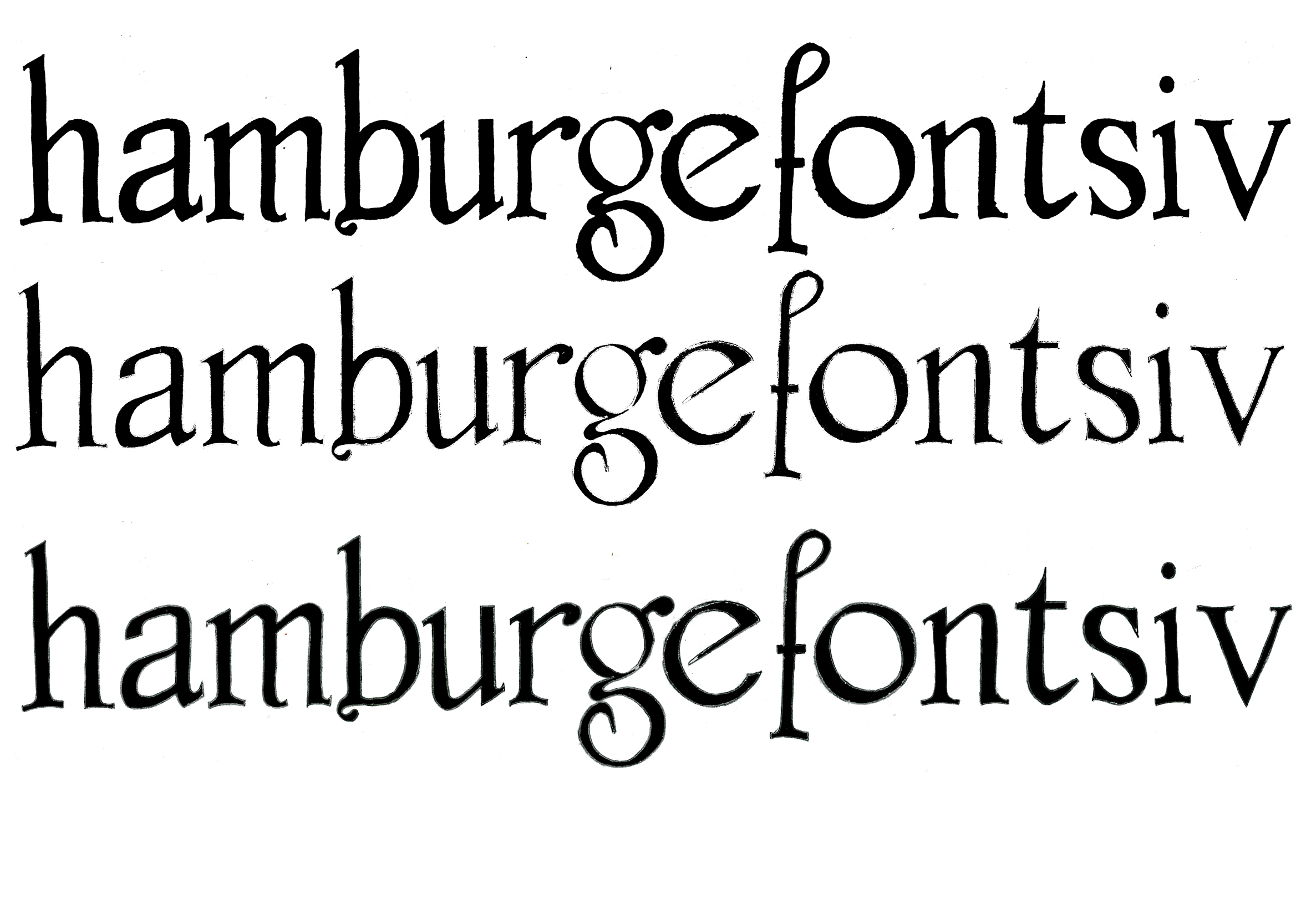
Thanks in advance,
Jacqueline
It's a disgusting typeface,I know, but could any of you guys give me some pointers on strenghts/weaknesses, so that I can improve it??
Thanks in advance,
Jacqueline

What do you mean, 'disgusting'? I like it as it is!
Don't clean it up, just digitize it! Great design!
Pah, you flatter me.
Surely there are some improvements to be made?
The "o" and the "e" for example, don't really fit in with the rest of the letters.
Anyway, thanks!

Strengths:
- somewhat gothic charm - reminds me of Edward Gorey
- variation of treatment of bottoms of letters gives baseline energy
- approximate consistency of diagonal lines ties letters together
Weaknesses:
- unseriffed stroke of u looks odd to me.
- the ornamentation (on b, g, f) isn't consistent in style and scale.
- e and o don't fit (but you already knew that!). Try something narrower.
- the s should be thickest in the middle
- the jpg is too large! :-)

Don't give up! It's quite charming.
I haven't had many replies on my first efforts, so thought I'd give a little love here to help encourage you :)
Captured from web.archive.org on 17 Apr 2015. view this capture