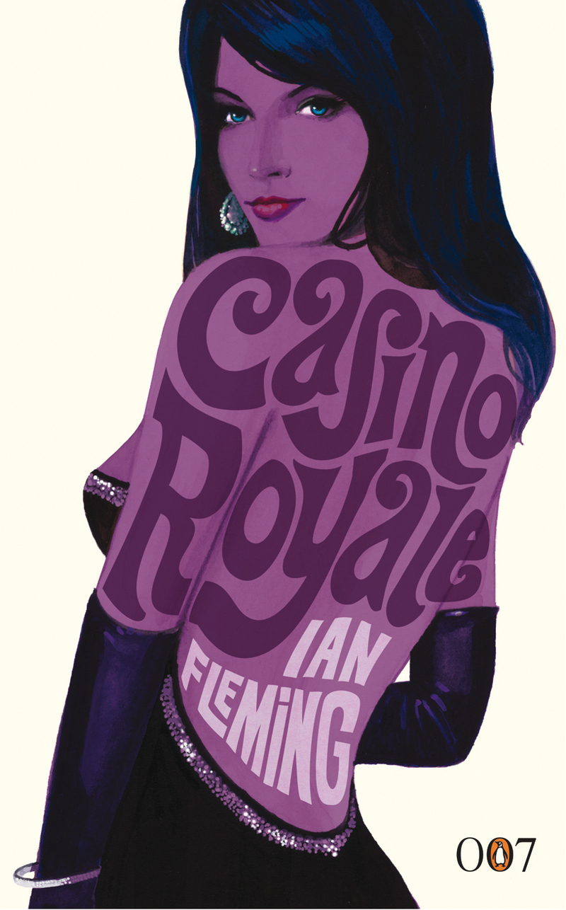
i LoVe tHis CoVer!
Since our assignment was to find a book cover that was interesting and had a strong composition using both text and imagery, I chose Ian Fleming's cover to one of his James Bond series books, Casino Royale. Not only is the image of the woman striking, but the text is laid out to fit the form of her body. It is often difficult to layer text on an image, since many people get distracted and the text goes unnoticed. This cover, however, is a fantastic example of text done well over an image. The font has a sophisticated feel but at the same time looks as if it could've been drawn by hand. Even the colors echo the nature of the book, purple is a good choice, giving the cover a mysterious eye-catching look to it. This allows for the text to appear to be flowing across the woman's body. The text in the lower right-hand corner stamps the James Bond book series with a classic font that gives credit to Penguin Publishing.