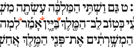
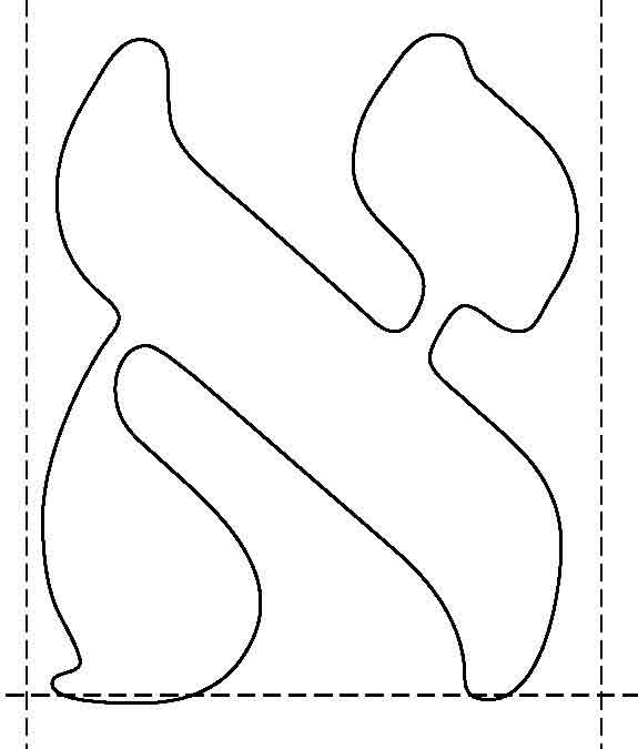
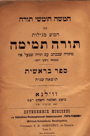
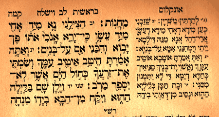
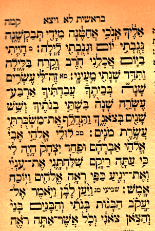
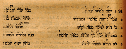
Here is a hebrew font I am working on these days.
the font was developed as OT using MS-VOLT
the font know to place the nikud+taam as one under the letter, which means that the nikud is brought back acourding to the width of the spesific taam so both the Nikus & Taam are placed optimaly under the letter.
there are still acouple of 'Dibukim' I yet to check but they are being worked on
here is a sample file of Megilat Ester With Nikud And Taamey Mikra.
Would to here your proffessional opinion.
Eli Fried
| Attachment | Size |
|---|---|
| Ester.pdf | 113.85 KB |