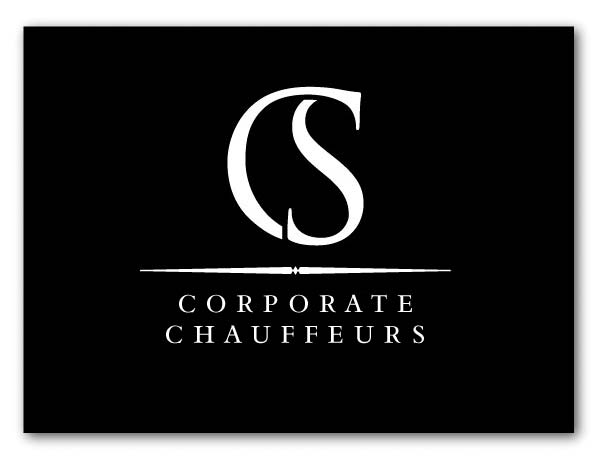
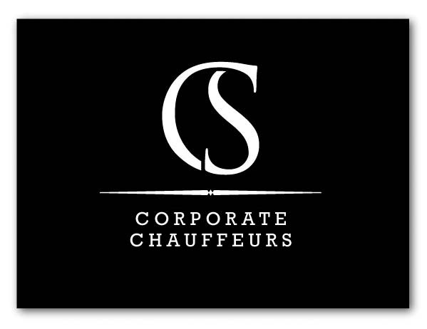
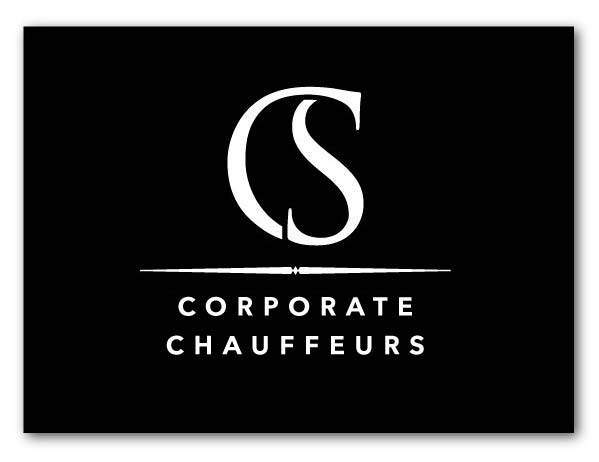
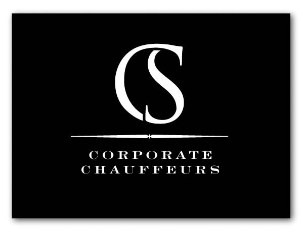
I don't normally post my stuff here (as I invariably self criticise way too much to put myself up to be knocked down by others), but recently did a logo concept for a chauffeur business. They wanted something elegant, that was type based. Now I know it's Trajan (yes I know, burn me at the stake), but they probably don't want to stump up for Requiem.
Just interested to know what you guys think, as it's one of only a few logos I've done which really focus on type forms instead of more "in yer face" graphic device based identities.
Be gentle, but firm!
Thanks
Steve
| Attachment | Size |
|---|---|
| logo6.jpg | 30.87 KB |