Typophile

Thomas Cannon Photography

I am starting a photography business and I need my type solution critiqued. I am with the icon since I use it for my graphic design business. I would like to have a sans serif with more character, but I know it can't have too much because it has to match the strength of the icon.

Thanks,
Tom

I agree with you. The sans is far too generic to be considered for this design.

Do you have a budget for type?

Mikey :-)

I always do if it the right fit. Do you have a suggestion?

Tom

I think you are right to go with something that suggests it was drawn with the same monoline as your icon... consider Estilo for lots of options in how much character to inject.

I suggest Variable as one that might better compliment your logo.

Here is what I ended up with:

Good choice, Tom. I didn't get in the thread until you were done. The forms of the round characters feel more at home with your logo's aesthetic features.

Thanks Chris.

FWIW I think the end result is perfect. Not a thing to change.

I agree, very nice!!

Sharon

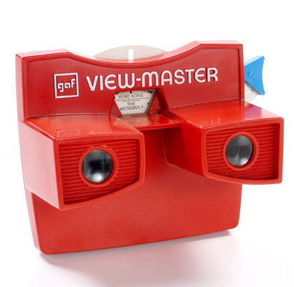
The icon looks like a 1950s View-Master to me. Is that intentional? It was the first thing I noticed -- it really jumped out. I get the T and C, but still...

WOW great image, I think you should go with it!
Go with your gut feeling you will never be able to satisfy everyone here or elsewhere.

Guerrizmo+Design

Thank you all for your comments.

Gus, I was raised on raised on retro viewfinders, so I may subconsciously be drawn to that style. I am using a retro color palette on the cards also (This is a work in progress):

It's really very lovely work!

This is seriously very nice. The lockup and cards look done to me.

this turned out exceptionally.

nice work

Hope I didn't give the impression I didn't like the icon -- I do, very much.

I didn't get that impression Gus. I like almost anything retro and I am sure I am influenced by it. I like to blend retro and modern (when I can) to make them look cohesive.

Captured from commoncrawl.org on 18 Apr 2015. original URL