Typophile

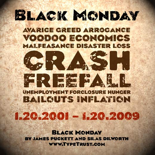
TypeTrust presents Black Monday by James Puckett and Silas Dilworth

blank

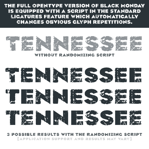
Black Monday is a distressed or “grunge” version of James Puckett's Recovery typeface. The core of the Black Monday type family is a single Opentype font containing three full character sets of varying degrees of distressing treatment. Every glyph in each of the subsets is unique to provide an organically weathered look and feel. Opentype scripting rotates through the character sets to automatically generate a pseudo-random look.

The three distinct glyph sets are also available as individual fonts for use in applications that do not yet support the Stylistic Sets Opentype feature. These styles are identified as Subset 1, Subset 2, and Subset 3, while the full version is simply "Black Monday Regular".

Black Monday is available now at www.TypeTrust.com

And to give credit where it’s due: Recovery and Black Monday are based on the work of Charles Coiner and the typeface Eagle Bold by M.F. Benton.

Very cool.

right charracter

very nice! i love it!

Nice use of "randomization"!

Why the "ligature" feature though (or is it a "stylistic set"--it's not clear here), and not "contextual alternates"?

@Nick: Silas can explain it better—the LIGA method, and the code that produced it, was his brilliance—but LIGA is more widely supported than CALT. The stylistic sets allow the results of the randomizer to be quickly changed. And everything has alternates configured so that the user can quickly change the results at any given character.

The subset fonts allow for a single, less chaotic look to be chosen; each set was distressed using a different technique and suffered less damage. In subset one the letters are nearly annihilated, in subset three they’re just weathered. The subset fonts also allow manual randomization in applications that do not support the other OpenType features.

The stylistic sets allow the results of the randomizer to be quickly changed.

That's clever.

It suggests an improvement to a random effect I put into Duffy Script, whereby the user can "bump" the sequence of characters in a word by inserting space(s) in front of a word. (Sort of like spinning the tumblers, to get a different look each time.) But being able to apply different Stylistic Sets, each of which will produce a different sequence, would be better.

hey james, any chance of some lowercase letters int he future? i love this face!

No lowercase for this one—Font Bureau already went there with FB Eagle (of course, they don’t do grunge type).

cool, it's still a wonderful face anyway. thanks!

Captured from web.archive.org on 3 Feb 2010. view this capture