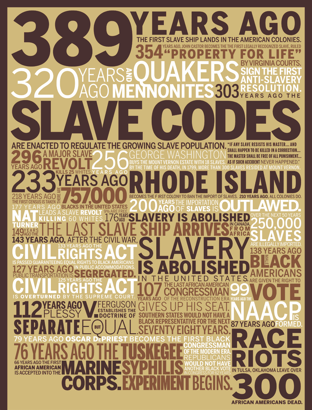
So two months ago I did this typographic mashup of black history after Obama won.
You can see it here, http://www.wallstats.com/blog/389-years-ago/
It became really popular so I decided to redo it and make a poster out of it.
The reason for redoing it are two. 1, because it's too long to be printed in current form, over 12 feet, so it needs to be compacted, and 2, the typography kinda sucks as I didn't pretty quickly and didn't expect much attention.
So the final product will be screen printed at 16'' x 48'' which means it has to be compacted as well as other limitations of screen printing. Nothing too small, heavy weights in smaller sizes, no small serifs.
I am about 25% through it and wanted to get some critique from y'all.
Some things I can concerned about are: Is it easy to follow each fragment? Being so compact I had to use three colors to break it up and orginize it. Also, there are some 'gaps' in there. I really couldn't just fill the entire space with type, too hard logistically. Do these gaps detract from the design or do they give the eye some breathing room and alternate focus? I also have not done any kerning or tracking yet, I guess I should do that right? Like the LA in 'SLAVE CODES'. Any other general thoughts would be ok.
The image is only a crop, it will be much longer. I also am using Frutiger exclusively and laying it all out in Photoshop because it's faster for me.
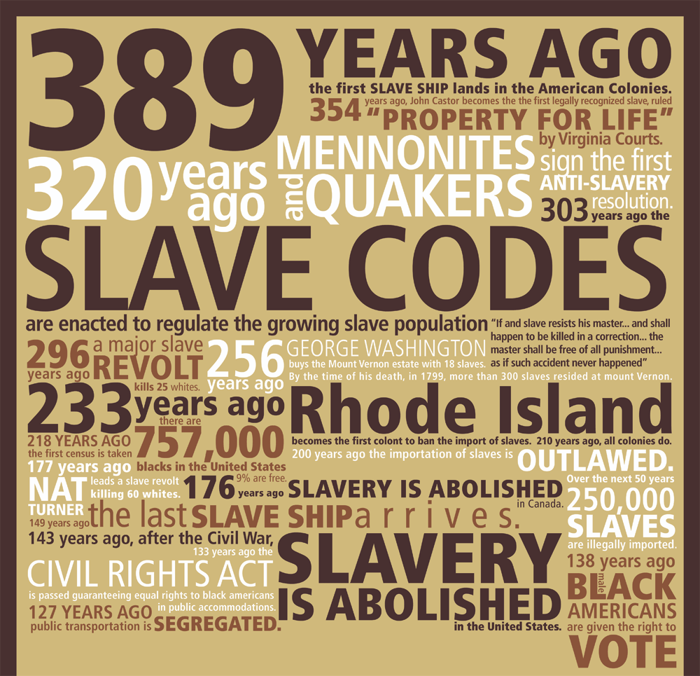
The image is also here http://img134.imageshack.us/img134/5622/typophiletestpk3.gif
Thanks!