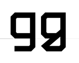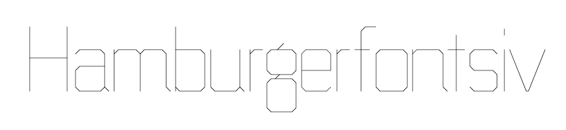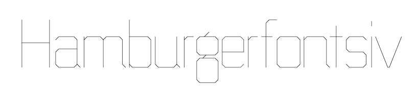
Building out this idea that grew out of a love for the lowercase g. No spacing, still working on proportions. Thoughts? Suggestions? In particular, I know there are a lot of squared/octagonal types out there, so any ideas on how to make this more unique/interesting would be helpful. Thanks!
| Attachment | Size |
|---|---|
| geo_square_prev.gif | 4.15 KB |
| geo_update_bold.gif | 6.01 KB |