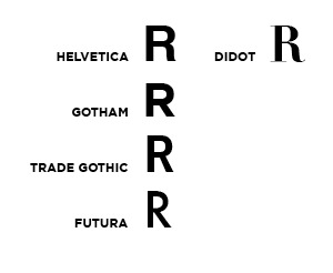
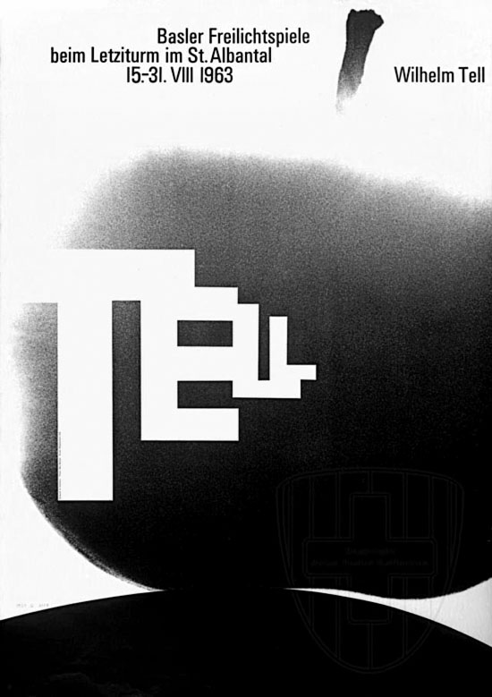
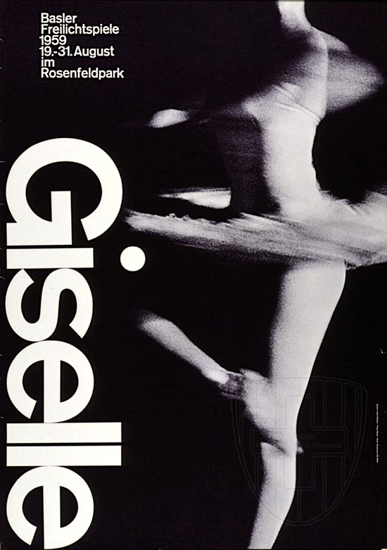
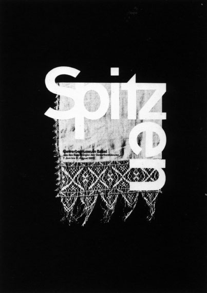
A humble question/rant from a design student: Can someone please remind me why we like Helvetica? Has anyone considered the shape of the uppercase “R”? The letterform indicates it doesn’t know whether it’s serif or sans-serif; it looks more like it belongs to something like Didot than to other characters in the Helvetica set. The lowercase “a” seems to have the same problem. Please see my examples below.
I would have to say Gotham or Trade Gothic are much more beautiful than Helvetica and are true sans-serif typefaces…even Futura has more consistent letterforms.
Cory Lasser
Parsons School Of Design
Degree Candidate