
I've created a personal logo for my webdesign portfolio. Please critique these. Which do you prefer? Thanks.
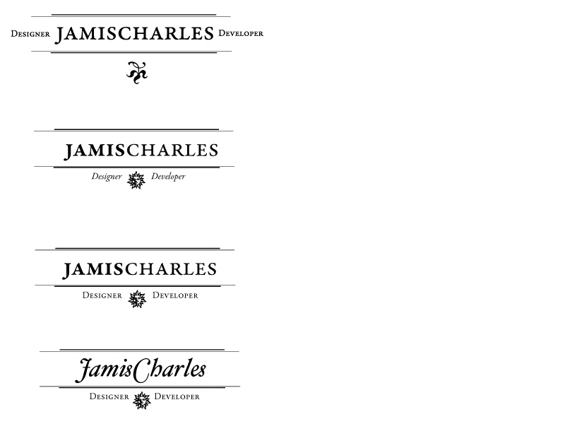
I've created a personal logo for my webdesign portfolio. Please critique these. Which do you prefer? Thanks.

#4 is far more interesting.
What has been your thought process?
What are you going for?
Paul,
This will fit into my portfolio site. For the site I'll be using a minimalist style that emulates some of the old newspaper look.
The style I am going for is somewhat like these 2 sites:

Logo nº1 with the "sun and titles" from nº3 but with tha same size as nº2

The two links you cited as models suggest 19th-Century typography. Your designs refer to 18th-Century styles. It matters because the former says "industry" and the latter says "enlightenment." What fits better with the way you want to present yourself?

While I reiterate the questions asked by PublishingMojo, I also believe that the fourth logo is more interesting.
Mojo, Dsgoen,
My current portfolio is at www.jamischarles.com
I am trying to redo it completely because I think I missed the mark on this one.
So for my new portfolio, to which the above is going to be the logo, I'll be using Garamond Premier Pro as my main typeface for the headings. It'll be a fairly simple site the main emphasis being the pieces of work, based on a grid.
I used Hoefler Text in the 4th piece above. I'd like to present myself as a competent designer/developer who enjoys beautiful typography. Hope that helps. Thanks for the help guys.

I'd like to see your name in the two different weights used in no. 4 in combination with the titles on either side as no.1, however, I would suggest removing the graphic as it doesn't seem to have any relevance other than to separate your titles which could be done without a graphic. I feel like the graphic was thrown in as an after-thought, but only because your using the rules above and below your typography to essentially frame your name.
If you would like to go with the style of the bottom three samples, where you're titles are going to be below your rules, then I might suggest "Designer/Developer" with a bit of space between, and playing with the weights of those as well. I wouldn't use the same weight usage as your name with the heavier weight on the left, because then your logo will become unbalanced. One other thing to consider is what your message is going to be through your logo. With emphasis on your name, the logo is about you, and with emphasis on your titles, the emphasis becomes about what you're providing.
Thanks for all the comments. Here's another sampling with the changes you guys suggested. Let me know what you think.
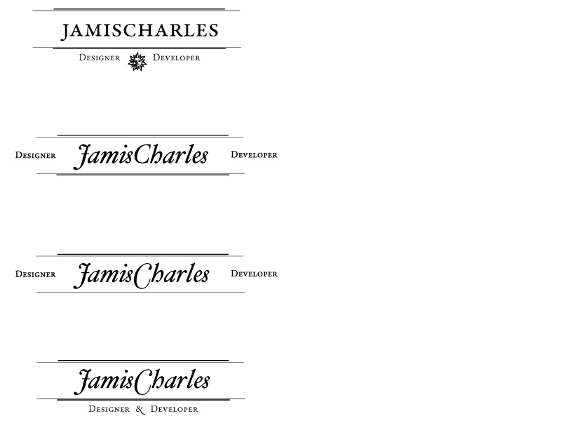
I like the latest no 4, because of the cleanliness. It gets your point across concisely, and the separations between you and what you do make the message have a bit more authority. It might be an optical illusion, but it looks like the bottom rules don't match the same spacing as your top rules, I didn't notice it until now. I'd be interested to see your thoughts on it, as it is your logo.
Side note: I had a typo in my previous post, I was referring to no. 3 weights, not no. 4. However, I think that the latest versions work much better.

I also vote for the new no. 4 version (with the top and bottom spacing for the rules adjusted to match).
By the way, I think you're right about your web site needing a redesign. The wood grain background and flashy picture frames fight against your desired image of a competent, careful designer interested in good typography.
~~~~~~~~~~~~~~~~~
When going from A to Z,
I often end up At Oz.
Imavery,
You're right about the spacing. I'll adjust it and then repost no. 4.
Final Run: I've made a few adjustments. Tried to fix the spacing issue (if it's still there, I'll fix it later). I've also thrown in some possible monograms.
Let me know which ones you like best or if any of them work for you.
Thanks again.
Jamis
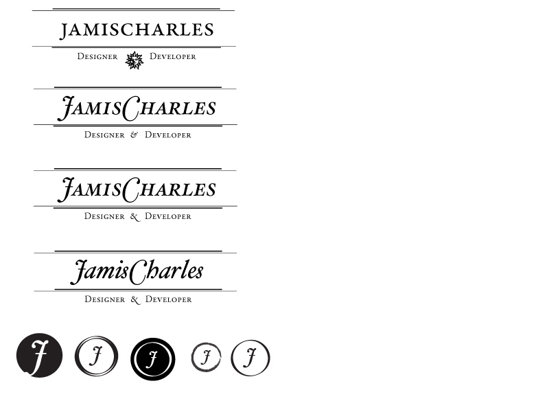
Once again, I prefer the newest version 4, EXCEPT that the bottom rules need to be a top-to-bottom mirror image of the top rules.
Can't say that I particularly like any of the monograms. It seems to me that since the C in Charles is basically a circular shape (however elipical it is) that you should be able to come up with a good-looking monogram of a J inside (or overlapping) a C.
~~~~~~~~~~~~~~~~~
When going from A to Z,
I often end up At Oz.
No. 4 still. I agree with with a2z on both accounts. If you want a monogram, you could do something with the second from the left. I'd try out JC within the two circles. I'd also loose the fill effect between the two circles, and I'd play with the weights of their strokes. You don't want your frame to overpower.
Captured from commoncrawl.org on 28 Apr 2015. original URL