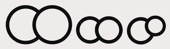
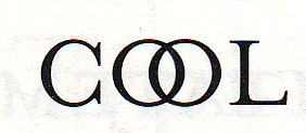
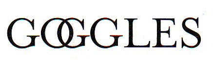
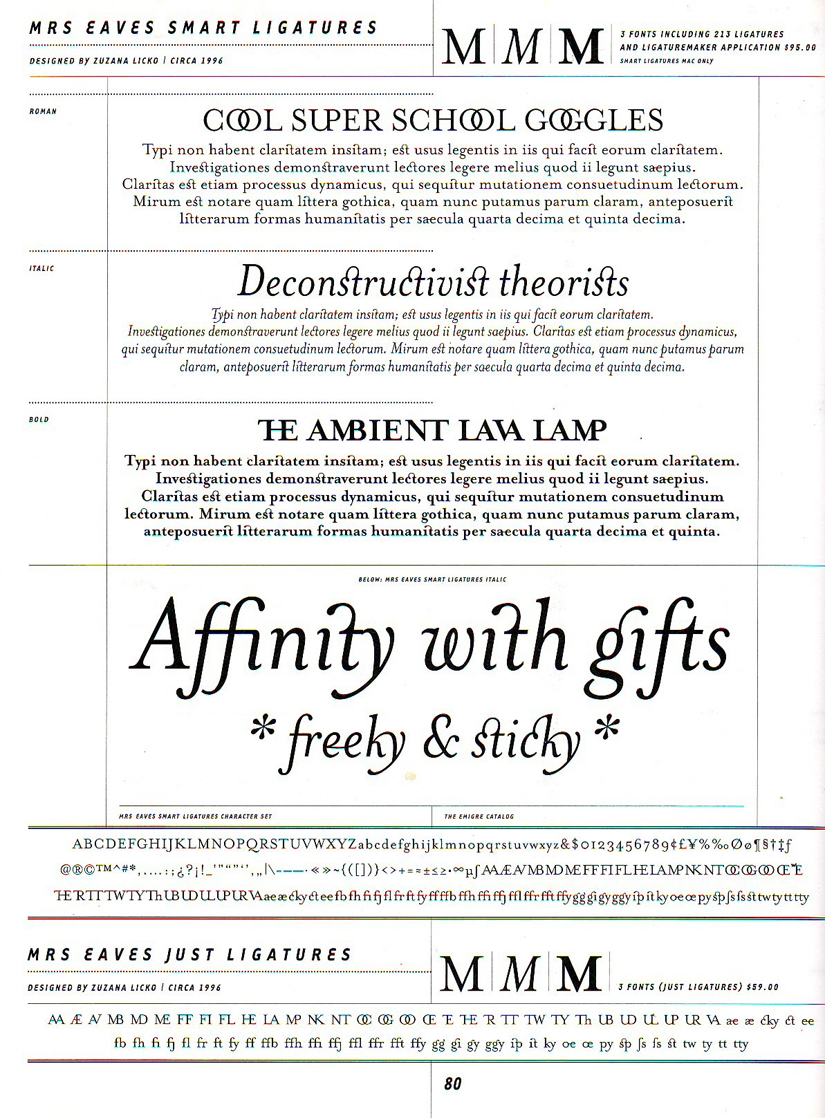
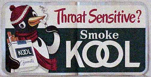
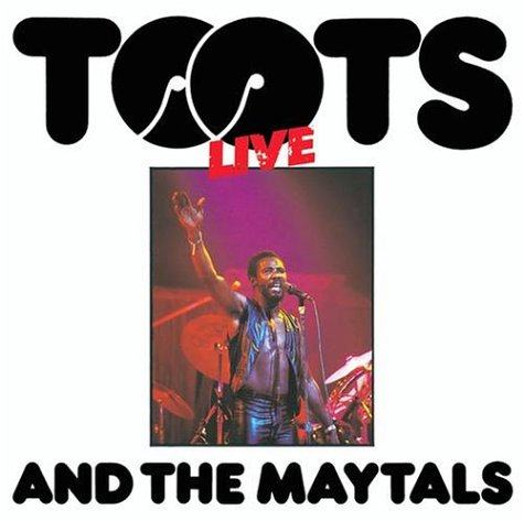
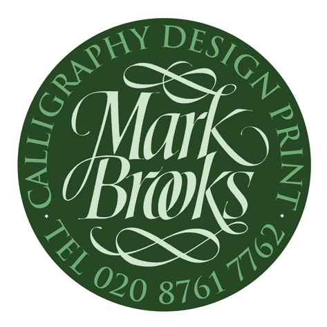
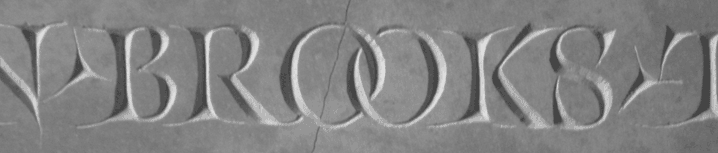
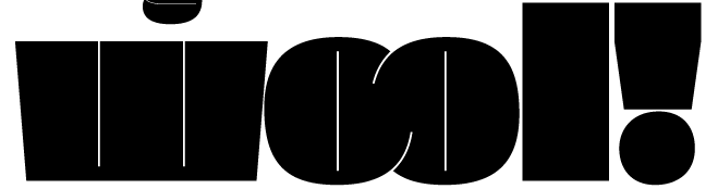
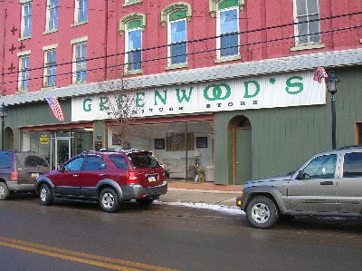
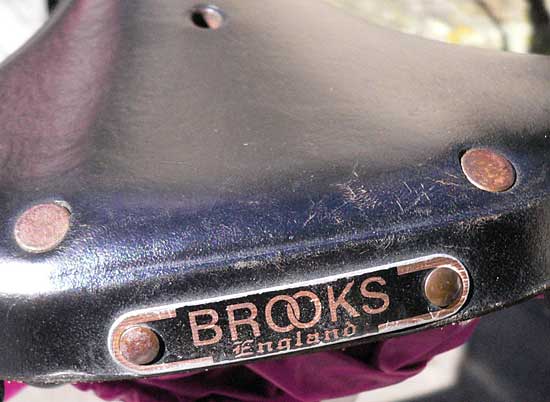
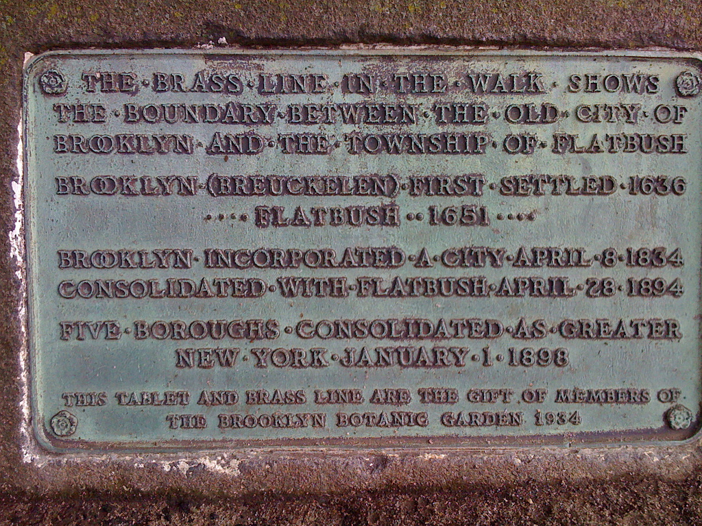
Does anyone know of any logos or another clever use of the “double-O” ligature? The only well-known logo that I can think of is for Bloomingdale’s. Someone sent me the logo for a retirement home that makes use off two intersecting "o's" but I don't think it is a true ligature. I have attached both logos to this posting.
I would like to use the double-O ligature in the title of a publication, but feedback from someone said that overlapping O’s reminded her of unity, or gender symbols (male and female). While that's true, I wouldn't normally think of that when seeing it in text.
I think the double-o ligature looks classy in certain circumstances.
What are your thoughts?
| Attachment | Size |
|---|---|
| Bloomingdales logo.jpg | 153.75 KB |
| 5501-medium_logom.jpg | 13.15 KB |