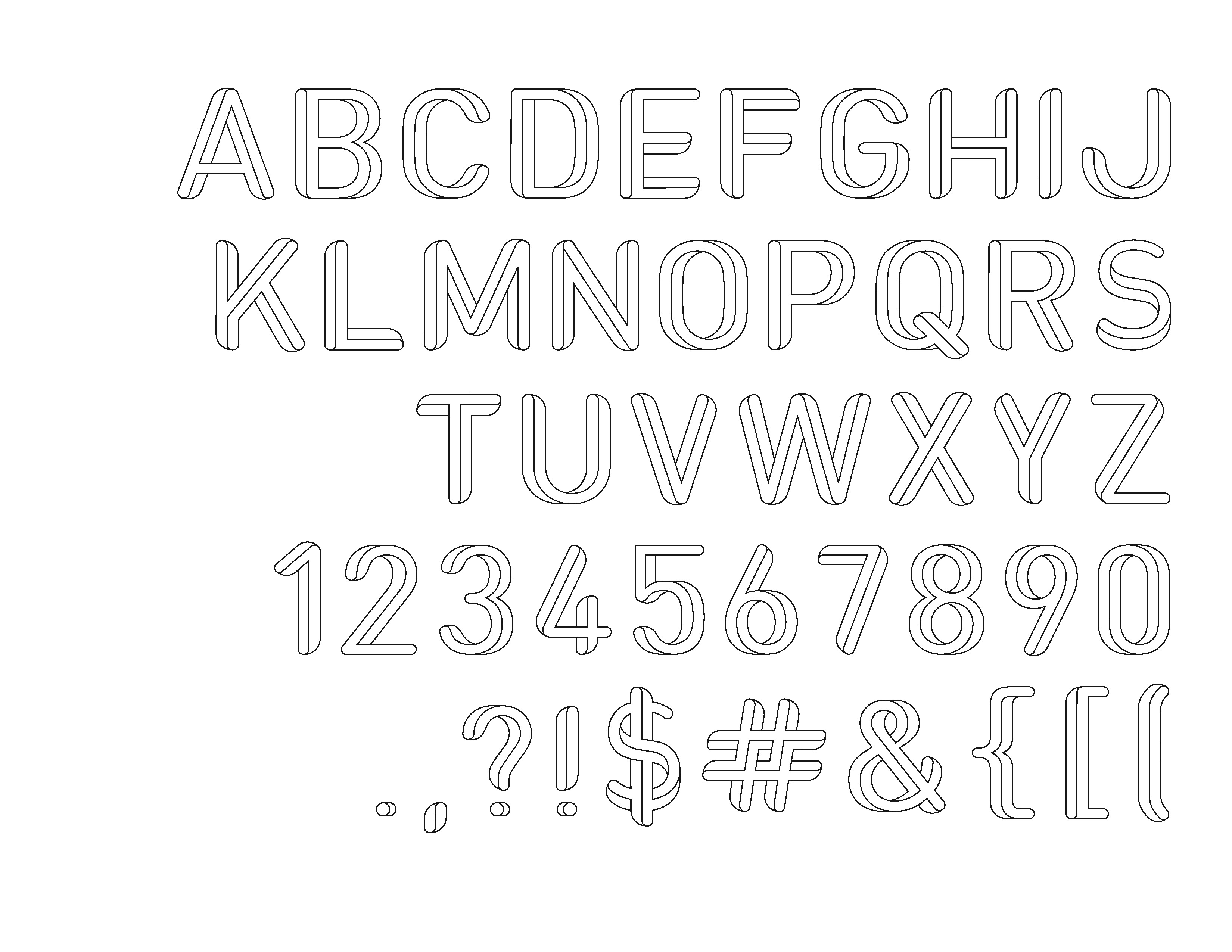
Lemme have it.
| Attachment | Size |
|---|---|
| reganjohnson.jpg | 636.3 KB |
Lemme have it.
| Attachment | Size |
|---|---|
| reganjohnson.jpg | 636.3 KB |

Brilliant idea, well-executed. I'd start the 'V' the same way you do the 'W' and 'Y'. It feels like it's facing the wrong way.

I think V is meant to look that way --- like the ryte half of W. Anyway there is no ryte way or orientation for elements in this font as it defies the rules of perspective and three dimensions.
Regan—helo and welcome to Typophile. This type design looks to be in the spirit of Roger Penrose's impossible triangle, Moebius strips, M.C. Escher et al.
j a m e s

Stephen is right: brilliant and well-executed. You did a great job designing this with letterforms that feel totally contemporary!

I am digging this! I also have a client for whom I've been looking for something like this. So, please finish it ;-) I'd buy it.

Dang Reg, someone's been productive over the break.

This is cool. That 8 is blowing my mind.
I'd enlarge the period (and dot of exclamation/question marks).
Of the glyphs that lose the "dimensionality" on some horizontal parts (ESZ25), I think the 5 crossbar misses it most - but shortening it might be all it really needs.
4's trunk looks too stubby, and 2 seems to be falling rightwards.

Looks excellent. I do think the characters that miss some of the dimensionality need to have it too (ESZ25). I could try to explain how you could fix them, but I'm quite sure you know how to do that yourself. :)

This is really funky. You could even do a shaded version to overlay? I love that K!
It reminds me of a childhood book, Adventures with Impossible Figures.
In a way it is difficult to critique this as it plays tricks on my eyes.
So this is to do with the underlying shapes: I think J could be narrower, and the top bowl of B and R smaller. Y should be wider.
And i think the 3-d needs to be resolved slightly on N, S, and B.
Hope that's helpful! It's pretty good in every way. Are you going to do lowercase? (Not that it needs lowercase)
Wow, I didn't even see the multi-direction feel until I looked at the "6"!! This is great, I love it. It reads so well, but then it has some spunk. I'd buy it too, please finish and let us know where to buy it! :)
courtney
Very impressive! Feels fresh and modern. Some thoughts: I reckon the ! could stand to be a touch taller; not sure about the crossbar on the 5; think J is a little wide and Y a little narrow.
Great concept! Now, where (somewhere here) did I see that five-legged elephant that would go so well with this?
_6718.jpg)
Yes, you could include a set of impossible dingbats as ornaments in the font!

http://www.typophile.com/node/28413
—
Carlos Fabián Camargo G.
Captured from web.archive.org on 17 Apr 2015. view this capture