7-Zip program is a free, open source file compressor for Windows. Very capable and well-written proggy, saved me on more than on occasion, highly recommended, etc.
Their existing logo is bold and distinctive, but they don't appear to be paying much attention to the branding and pretty much "crowd-source" it. They have accumulated quite a bit of logos in their gallery, though not many are actually notable.
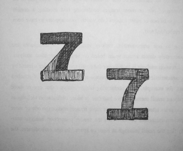
Now .. there is a 7 and there is a Z in the name. If that's not a match made in a logotype heaven, I don't know what it :)
Here's one of the ideas. It looked very nice and balanced on the paper, but now that it's vectorized, it seems to be missing something and I just can't put a finger on it.
Any thoughts, comments ?