
Hello,
opinions and comments are welcome.
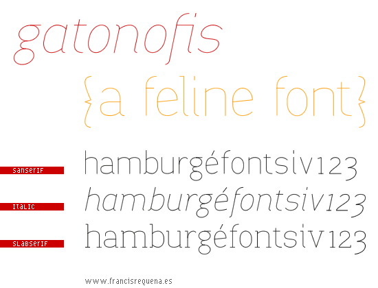
Hello,
opinions and comments are welcome.

It's graceful and nice, good job! No bold or Black?
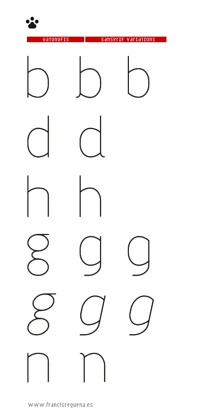
Thankyou TypeDog!. I’m still working on the glyphs. I would like to do the light, book and bold weights. But I have some doubts about some characters.

A cat and dog thread!
Of the sans variations, I like the second b the least. (And probably also the second n [which works fine in the italic version], but the second d doesn't bother me.) And your s is falling a bit forward.
I look forward to seeing how this develops.
I like the paw its cute! I like the 1st b and 2nd b the third looks as if it is about to roll off. I like the lower case 1st g, however it seems too symmetrical. All in all good job, but don't leave the bolds and the blacks out J/K. Good look and Happy Holidays to you and everyone else!

wow it's amazing !
I very like this way of thinking.
Thanks for your comments!
It’s true, g is symmetrical, but that was my intention. Maybe I use the second g for the cursive version.
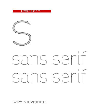
With respect to the s, you are right. There’s something rare... perhaps with this modification (see picture)
Happy Holidays!
P.D. Dogs and cats usually talk without problems about typography
Yeah your right gatonofis about dog's and cat's getting along.

The 's' is looking nice now :)
I think you should enlarge the lower counter of your 'g' for optical compensation.
Thankyou, your comments are very helpfull for me.
What do you think about the new ‘g’?
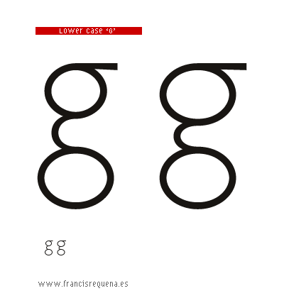
The new g on the right looks unbalanced in the larger size, but at the smaller size, it doesn't look as bad. Could you try them in a couple of words to see how they interact with other letters? good, gum, egg, grand, edge, gato, guardia, negro, etc.
Hello Speter,
Sorry but the new g is on the left. Here you have the words that you ask to me (no kerning, still). Thankyou.
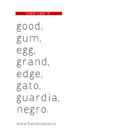
Ah, well the one on the left is certainly the better one! Try increasing the size of the head a little bit, but keep it circular.
More variations.
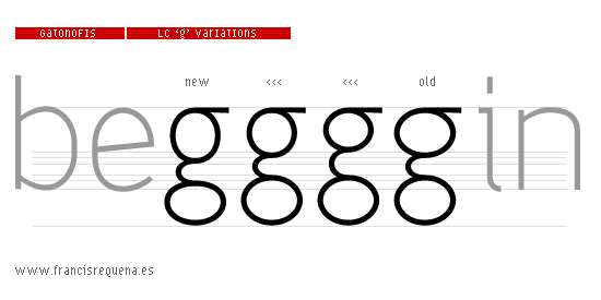
I prefer the first one for the join between the two bowl and the second one for the size of the bowl. I don’t know if a mix of those two would be nice. The s seems to me a little bit off balanced vertically, the top looks too large compare to the bottom. Good work!
I like the left-most new one best, though the top might be rounder.
I like it! Much better
Here I leave some variations of the ear of the ‘g’. Now I am trying to solve the problems of the ‘s’.
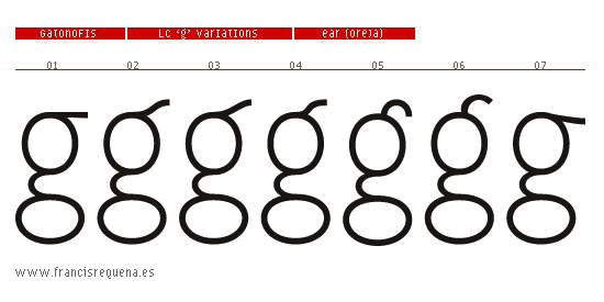
The first one would be less disturbing.
1 or 5, but test them in some words.
I like number 4 (half step between 1 and 5). And a new ‘s’.
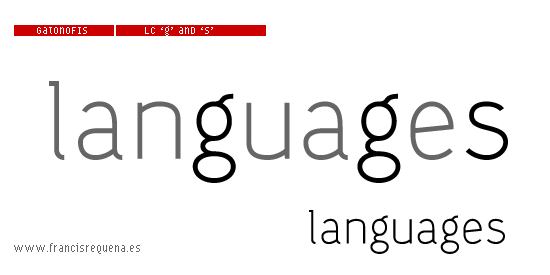
Regular and italic lower case.
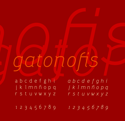
looking good

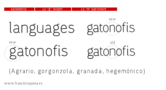
That g (the upright, two-story one) looks narrow to me.
Yes, it looks narrow. I have made a new modification and tested it with several words. Also I condensed the ‘n’.
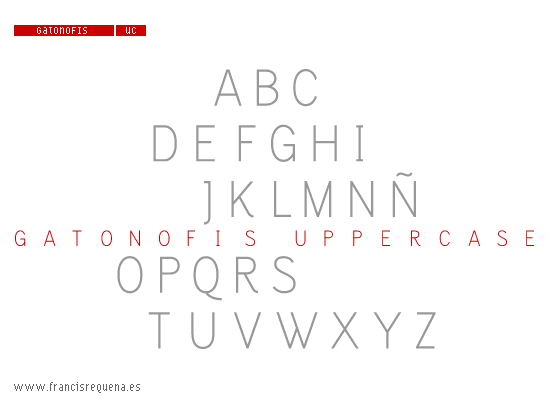
And now, the upper case.
Thanks to all for your comments about my work.

Did you also condense the "u", just like you did with "n"?
Otherwise UC looks nice. But to my eye F, Z and M look a bit too narrow compared to others, K looks a bit top heavy, try matching Q's tail with "g"'s, match "S"'s shape with "s", V, X and Y are almost certainly too wide...
But the font itself looks really nice and it is quite original in shape. I like it a lot. Also its light weight looks very nice so combining it with nice small details makes it more appropriate for display. I like it a lot. Very calming, warm and inviting.
___________
Robert Koritnik
Thanks Robert!
When I condensed the ‘n’, I matched it with the ‘u’, ‘h’ and ‘m’ but I forgot to use the new characters on the examples. I’ve made a new versión wider of the ‘F’, ‘Z’ and ‘M’ and some changes on the ‘K’. I’m not sure about ‘V’, I like the same angle with the ‘A’. I’m still working with the ‘s’ and ‘S’...
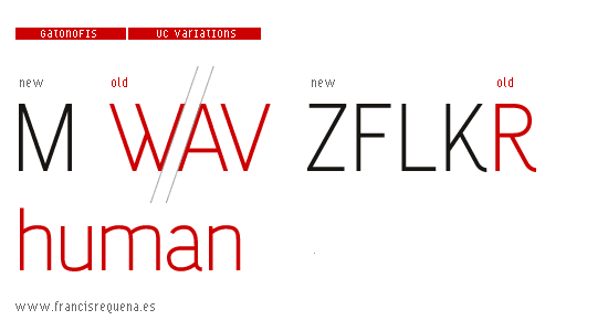
I'm wondering if the northeast curve of the a should be a bit tenser.
A little change: Two different ways
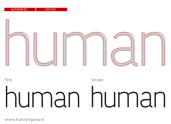
I think the second variant is spot-on!

very nice! it's looking good!
Captured from commoncrawl.org on 18 Apr 2015. original URL