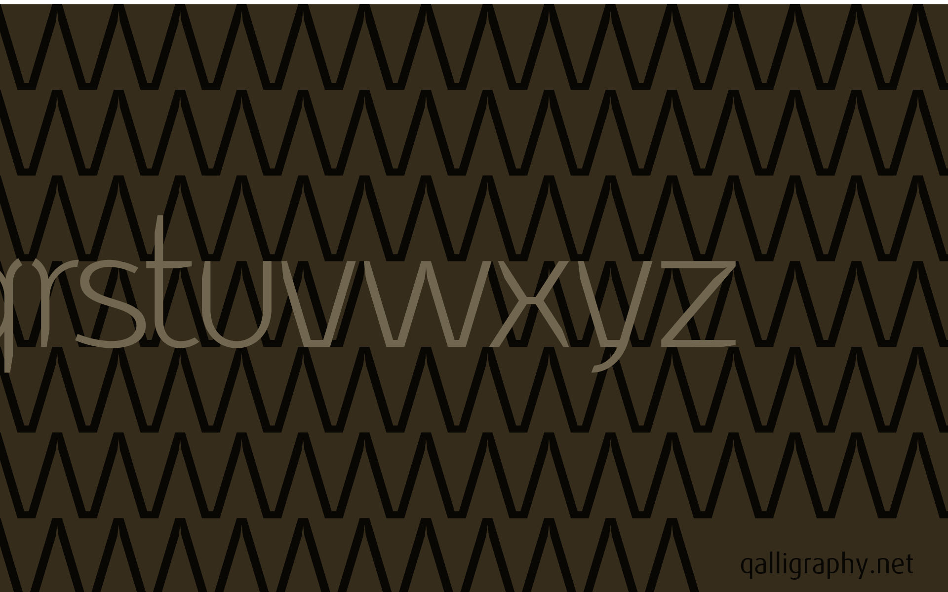
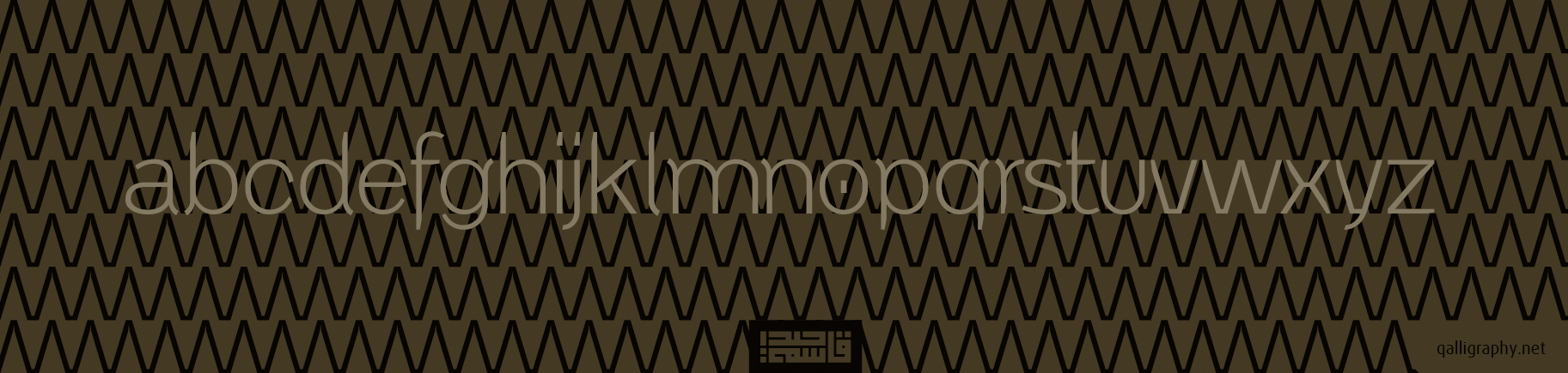
I try to mach between tow style..
I try to mach between tow style..
What are your suggestions ?
[qassim haider]
qalligraphiy.net/fla/
sense of calligraphy

Distinctive, clever, and well-formed.
I feel the upper end of the c goes down just a little too far.
Where the arm of the k meets the stem, try putting the narrowing bend of the outline on top of the stroke and not the bottom.
can you explain to me with sample of pictures
This should make my meaning clear:


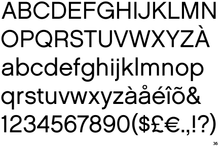
Looks like you modified this from House Chalet 1960.
cerulean
Thank you very much,'ll show you the result soon.
--
SuperUltraFabulous
http://www.identifont.com/samples/houseindustries/ChaletLondon1960.gif
Perhaps, but not much...
Captured from commoncrawl.org on 27 Apr 2015. original URL