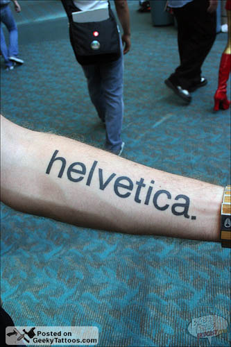
Semi-jestfully I would talk with my friends about how stupid it would be to get an I <3 Helvetica tattoo... an even stupider idea would be to get it as a tramp stamp. Well, I got good reviews from my posse and impulsively I got it last night...

Semi-jestfully I would talk with my friends about how stupid it would be to get an I <3 Helvetica tattoo... an even stupider idea would be to get it as a tramp stamp. Well, I got good reviews from my posse and impulsively I got it last night...

What made you go with bold? I personally like the lowercase a that does not terminate at the baseline. Having said that, neither do I have the balls to get something like that on my body. More power to you.

A Tramp Stamp?! Oh man. That's terrible.

I dare somebody to critique the kerning.
@clashmore As I age and get fatter, that kerning is going to be hideous. Good thing I don't have to look at it :)

Well, I got good reviews from my posse and impulsively I got it last night...
As a veteran tattoo-receiver, impulsively get a tattoo is always a very bad idea. My only regret is my very own tramp stamp…
However, I kind of love this. I just hope you always will too :)

Are we sure that isn't Arial? ;-)

haha a helvetica tattoo!
thats so funny

It's cool because its unique.
also as a tattoo vet, impulsive is not always wise, but is this pretty cool, in a very geeky way! :-D i'm not sure what kind of type-tatt i would get...
Im thinking of fraktur font for myself

thank god you got it as a tramp stamp!! I've been thinking about getting a curlz one myself!
- Scott Sullivan
one thing that gets to me is the use of blackletter type for tatts set really badly, or set
l
i
k
e
t
h
i
s
down an arm or back or something... a very non-designer friend got his daughters name done this way and while the tatt is good quality as a designer, it make me cringe...
Like a hotel by the hour sign lol.
There tons of knuckle heads with awful design's as described where I stay at.
My plan is to do it right after all it's permanent. Allot of so-called thugs and gang members have that vertical nightmare displayed on their person. I would rather have some trying to read it when its horizontal then otherwise.

tramp stamp are base, poor Helvetica, anyway kinda cool but you cant see it?

Uh. . .I like the tattoo and think it's very original. Kudos. However, I am at a loss and maybe revealing how little street cred I've got by asking, what does "<3" mean?
Again, it's a cool tattoo but please forgive my ignorance.
well it's a heart, of course!

I thought it was a little penis pointing left.

If it's a tramp stamp, shouldn't you have used Hobo?

lol at PublishingMojo
PublishingMojo: you, sir, are an winner :)

A humble question/rant from a design student: Can someone please remind me why we like Helvetica? Has anyone considered the shape of the uppercase "R"? The letterform indicates it doesn't know whether it's serif or sans-serif; it looks more like it belongs to something like Didot than to other characters in the Helvetica set. The lowercase "a" seems to have the same problem. Please see my examples below.
I would have to say Gotham or Trade Gothic are much more beautiful than Helvetica and are true sans-serif typefaces…even Futura has more consistent letterforms…but it's a gutsy tattoo nonetheless!
Cory Lasser
Parsons School Of Design
Degree Candidate

This tattoo holds a dual-purpose : it can morph to either Helvetica Extended or Helvetica Condensed if the bearer lost/gained any weight!

I've got a few shots on flickr of a young man who proudly identified the face chosen for his tattoo as Adobe Caslon Bold.
The text is that of a psychiatrist's suicide note from the 1920s.
As someone commented there on one of the shots, "I don't get tattoos generally, but this one I really don't get. Why would anyone choose an Adobe font?"
I'm probably just being ignorant here, but what's wrong with Adobe fonts? I thought they where of high quality.
Now that I've got my little Hobo joke out of the way, let me ask a serious question. Why use a font for a tattoo at all? A font is an industrial product, a tool for making an infinite number of letters the same way every time. Tattooing is a hand process, perhaps the last imaging art to defy automation. For those who find tattoos beautiful, the beauty is that each stroke is unique, as organic as the body it's inked on.

"I’m probably just being ignorant here, but what’s wrong with Adobe fonts? I thought they where of high quality."
I personally love Adobe Garamond Pro. Though I have been told it deviates from a true Garamond slightly. Still if it were called Adobe Robert Slimbach Pro it would still be beautiful.
I consider Adobe fonts to be of a good quality.
PS - As your skin changes with age the counters and the kerning will all warp. Luckily its on your back. Otherwise it would become a bad obsession you could never correct.
PPS - Its still pretty awesome you went through with it.
Photoshopped? I demand proof, not sure what other proof though.

Here's another image from New City Media's website. It's still up right now... www.newcitymedia.com.
Other than that, I suppose for further proof you can check my website at www.glennsorrentino.com... im going to put a full body portrait online soon.
@PublishingMojo One word: Postmodernism. That's the beauty of tattoos. There is no standard. But even if there was a standard, each letter form was created by a human hand, imagined from a human mind. A fine typeface is a great art form.
It's silly for any designer to say that a typeface should be nothing but an industrial tool. I think we all know that that just isn't the case.

Too bad you didn't do this a few years ago. You probably could have gotten into this book:
Body Type: Intimate Messages Etched in Flesh by Ina Saltz

@ cory.lasser I am a fellow Parsons student and I love Helvetica. It is well balanced, and those slight flourishes that might resemble serifs help out with that. But the true beauty of it exists in its horizontal terminals that ground the letters, The bold negative space that make the forms recognizable even when you crop and distress the type, and the clean look that will adapt to anything.
I love it! I have two ampersands tattoo'd. Big fan of type on the body.
"To give emphasis only to beauty makes me think of a mathematics that deals with positive numbers only."
Paul Klee
Diaries 1989–1918
1989-1918... wow a time traveller...
;-)
I got drunk this past weekend and almost got an 'I <3 curlz' tramp stamp, just to post as a response here. THANK GOD I DIDNT
- Scott Sullivan
ha!
Original? I thought it was a bumpersticker ad for Gary Hustwit's documentary. Akzidenz Grotesk, now there's a cum-target.
Tasty
Akzidenz Grotesk, now there’s a cum-target.
Ha Ha that's what allot of little tramps have out here in Southern California, cum-target.
Guerrizmo+Design
I would like to let everyone know that I am almost finished with the second volume of "BODY TYPE: Intimate Messages Etched in Flesh," and that there is still time to contact me if you have a significant typographic tattoo. I would love to include any Helvetica tattoos, and if anyone has contact info for the person with the suicide note text photo, I would be very interested.
Many thanks; email me directly at ina@saltzdesign.com.
www.bodytypebook.com

http://www.geekytattoos.com/wp-content/uploads/2009/01/helvetica_.jpg
http://3.bp.blogspot.com/_2P93dzb3UnQ/SSDtK7cB_II/AAAAAAAAAMg/j1Iz5ru3fE...
http://www.helveticafilm.com/images/tatoo1.jpg
http://www.porcupinesfloat.com/wp-content/uploads/2008/07/tattoo.png
http://media.photobucket.com/image/helvetica%20tattoo/gomnam/computer-ge...
http://www.devlounge.net/wp-content/uploads/2010/02/tattoo.jpg
http://3.bp.blogspot.com/_ozLGi0bsQqg/SNy4r6a9V1I/AAAAAAAAAMY/6Yd0QG3ax0...
Cross tattoos can have several meanings. While the most obvious one is in a religious context there are many other reasons to choose a cross as an idea for a tattoo. There is certainly no doubt that there is a sense of elegance with a cross tattoo, the simple outlay of the design enables you to personalize and really make it your own through a wide variety of means. Cross tattoos can have signigicant and personal meaning to its owner which is truly a statement of individualism.
Captured from web.archive.org on 14 Apr 2018. view this capture